This guide outlines the available settings and properties for Containers and Tiles available in the Layout Editor in Myriad 7.
Please note that whilst very effort is made to maintain this reference guide, new properties settings and completely new Tiles may be added in future releases.
TABLE OF CONTENTS
- Dynamic Layout Hierarchy
- Layout Editor Basics
- Screen Properties
- Framed Container Properties
- Tabbed Container Properties
- Tile Properties
- Custom Date and Time Format Specifiers
- Audio Monitor Tile
- Auto Player Tile
- Clock Tile
- Dashboard Tile
- Encoder Tile
- Favourites Tile
- HTML Display Tile
- Listener Request Count Tile
- Listener Requests Tile
- Log Tile
- Media Browser Tile
- Media Deck Tile
- Media Grid (Media Wall) Tile
- Media Info Tile
- Library Tile
- Media Player Faders Tile
- Media Players Tile
- Media Preview Tile
- Mini Media Players Tile
- Now Playing Tile
- Pad Tile
- Quick Play Tiles
- Quick Recorder Tile
- Segue Editor Tile
- Simple Mixer Tile
- Smart Display Tile
- Smart Info Tile
- Split Manager Tile
- Split Station Tile
Dynamic Layout Hierarchy
It is important to understand the structural hierarchy when designing layouts in the Layout Editor.
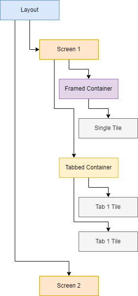
Each Layout contains one or more Screens (based on available screens in Windows). Each Screen host one or more Containers which in turn host Tile such as MediaGrid, Log, Dashboard etc.
There are two types of Containers available:
- Framed Containers - Host a single Tile
- Tabbed Containers - Hosts multiple Tiles which the User can switch between using tabs.
Containers are sized an positions on Grid with the number of columns and rows determined on a per Screen bases.
Layout Editor Basics
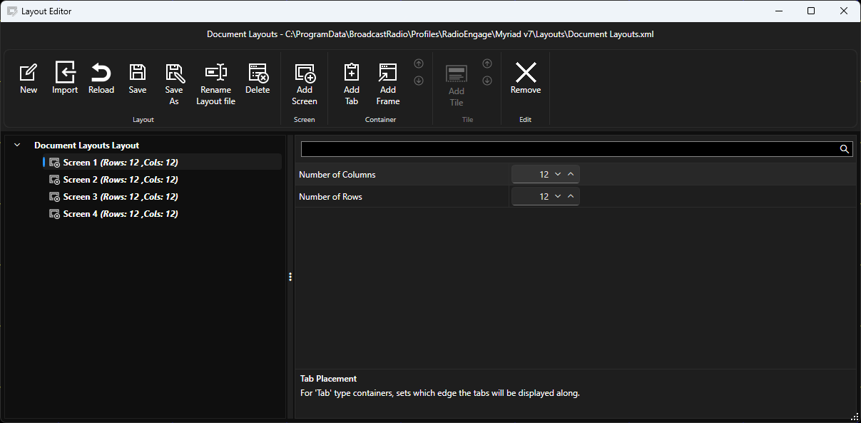
The ribbon includes all the basic tools for managing Layouts and adding Screens, Containers and Tiles.
Layout Section
- New - Creates a new Layout.
- Import - Import a Layout from a layout XML file.
- Reload - Reload Layout from most recent save (discarding changes).
- Save - Saves the current Layout.
- Save As - Save the current Layout as a new file.
- Rename Layout - Renames the Layout.
- Delete - Deletes the currently loaded Layout (requires confirmation).
Screen Section
- Add Screen - Adds an additional Screen to the Layout.
Container Section
- Add Tab - Adds a Tabbed Container to the selected Screen.
- Add Frame - Adds a Framed Container to the selected Screen.
- Up/Down - Moves the selected Container up or down the navigation panel. This also controls Z-order as Containers are rendered from the top to the bottom of the Navigation panel.
Tile Section
- Add Tile - Add an additional Tile to the selected Tabbed Container.
- Up/Down - Moves selected Tile up or down within a Tabbed Container (changes the order of the User tabs).
Edit Section
- Remove - Removes the selected Tile or Container from the Layout (requires conformation). N.B. You cannot remove a Contain that c hosts Tiles, you must remove the Tiles first,
The Navigation Panel allows you to select Screens, Containers and Tiles for editing.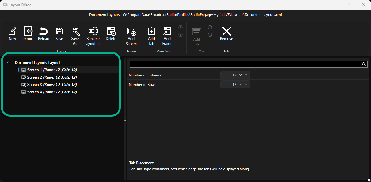
The Properties Panel displays the settings and properties for the selected Screen, Container or Tile.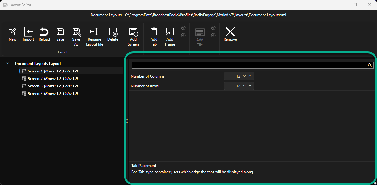
Screen Properties
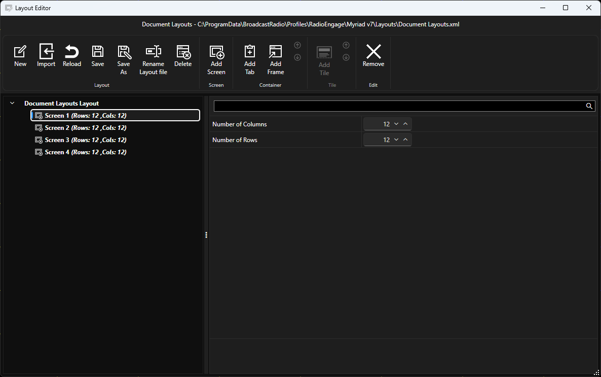
- Number of Columns - Sets the number of columns for this Screen.
- Number of Rows - Sets the number of rows for this Screen.
The example above will result in a 12 x 12 grid for Container placement.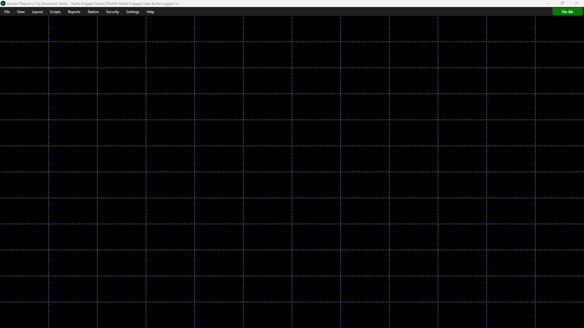
Framed Container Properties
Framed Containers are containers that host a single Tile.
To add a Framed Container, select a Screen and click Add Frame.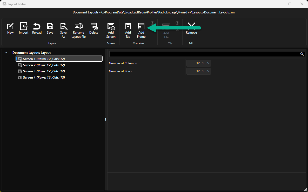
When you add a Frame, you must select the Tile that the Container will host from the available list. Select a Tile and click on OK to add both the Framed Container and the Tile to the layout.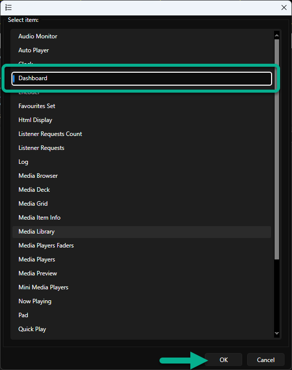
The Contain and Tile will be added to the Navigation panel on the left hand side of the Layout Editor.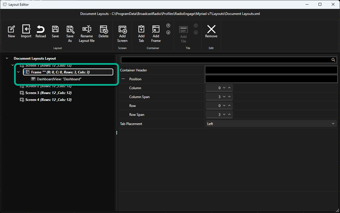
Select the Container node to access the Container properties.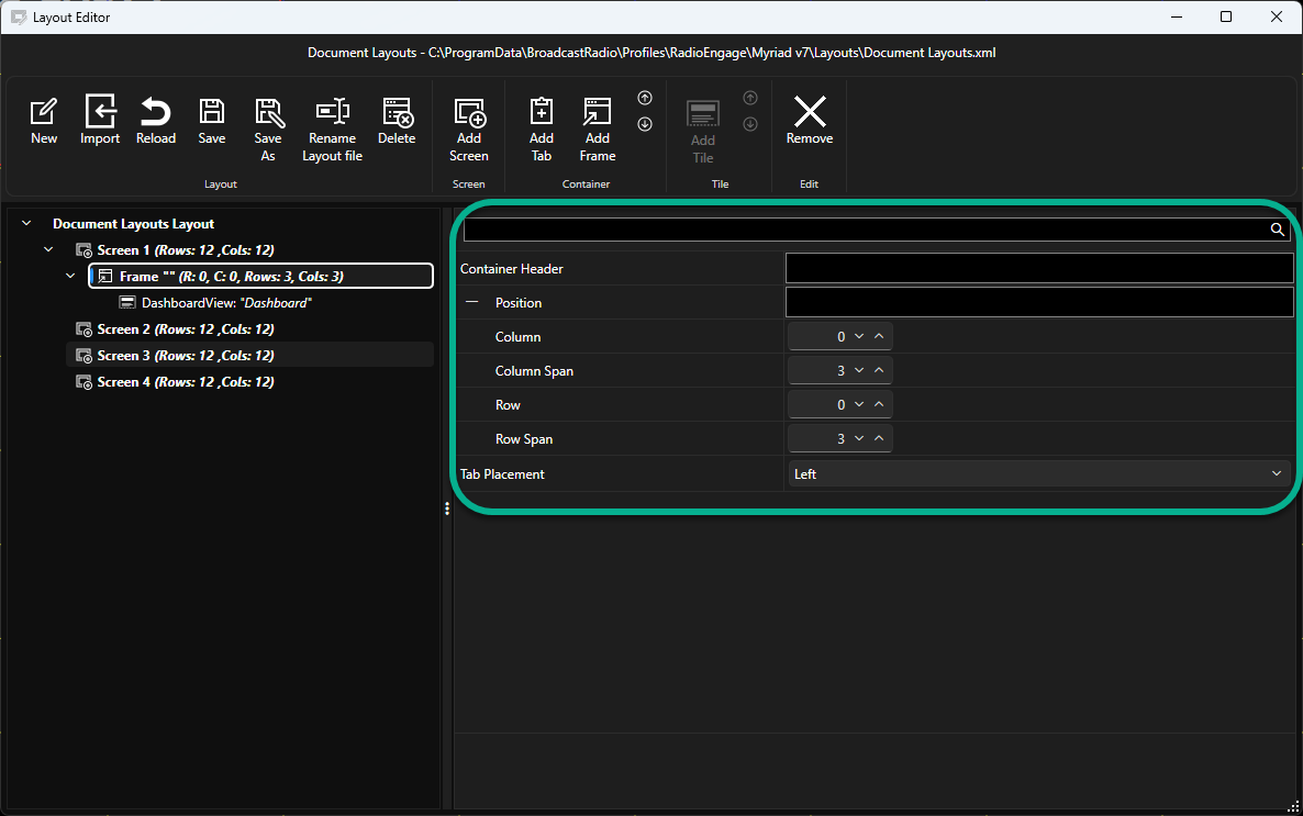
The options are:
- Container Header - Add a name for the Container to help with navigation of your layout. This name is not displayed in the layout itself.
- Column - Sets the starting column position for the Container. Column zero is the left most column.
- Column Span - Sets the number of columns the Container will span (the width of the Container).
- Row - Sets the starting Row position for the container. Row zero is the top row.
- Row Span - Sets the number of rows the container will span (the height of the Container).
- Tab Placement - This property set the position of the Tabs in a Tabbed Container (Left, Top, Right, Bottom). It is not required for Framed Containers.
Changes made to Container Properties are shown in real-time in the grid preview so you can use these settings to move Containers around the Screen and change the Container size.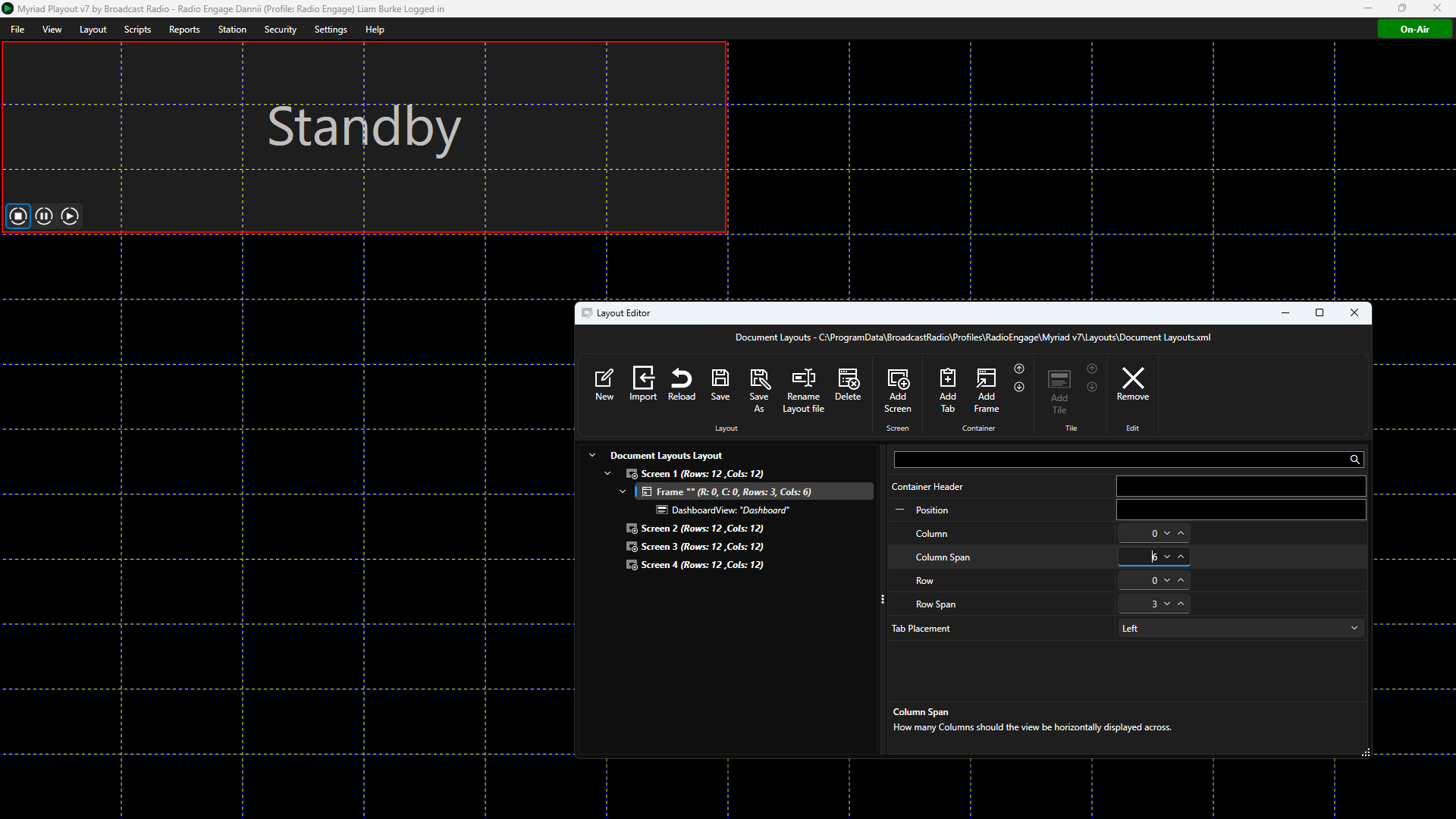
Tabbed Container Properties
Tabbed Containers host one or more Tiles, and allow Users to switch between the Tiles within the Container using Tabs.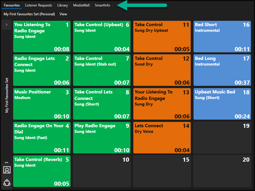
The screen shot above shows an example of a Tabbed Container that hosts five Tiles (Favourites, Listener Requests, Library, MediaWall & SmartInfo). Users can switch between the Tiles using the tabs located along the top of the Tabbed Container (the position of the tabs is a property of the Tabbed Container).
To add a Tabbed Container, select a Screen and click Add Tab.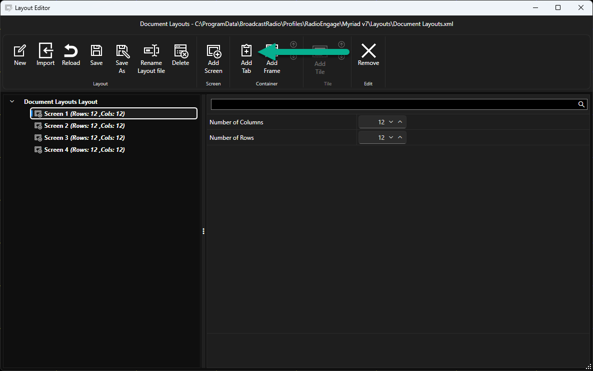
When you add a Tabbed Container, you must select the first Tile that the Container will host from the available list. Select a Tile and click on OK to add both the Framed Container and the Tile to the layout.
The Contain and Tile will be added to the Navigation panel on the left hand side of the Layout Editor.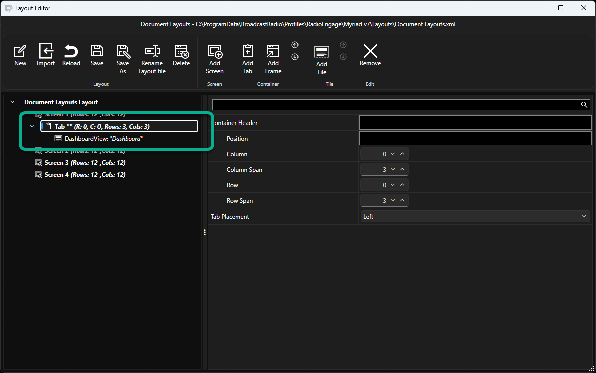
Select the Container node to access the Container properties.
The options are:
- Container Header - Add a name for the Container to help with navigation of your layout. This name is not displayed in the layout itself.
- Column - Sets the starting column position for the Container. Column zero is the left most column.
- Column Span - Sets the number of columns the Container will span (the width of the Container).
- Row - Sets the starting Row position for the container. Row zero is the top row.
- Row Span - Sets the number of rows the container will span (the height of the Container).
- Tab Placement - This property set the position of the Tabs in a Tabbed Container (Left, Top, Right, Bottom). I
Changes made to Container Properties are shown in real-time in the grid preview so you can use these settings to move Containers around the Screen and change the Container size.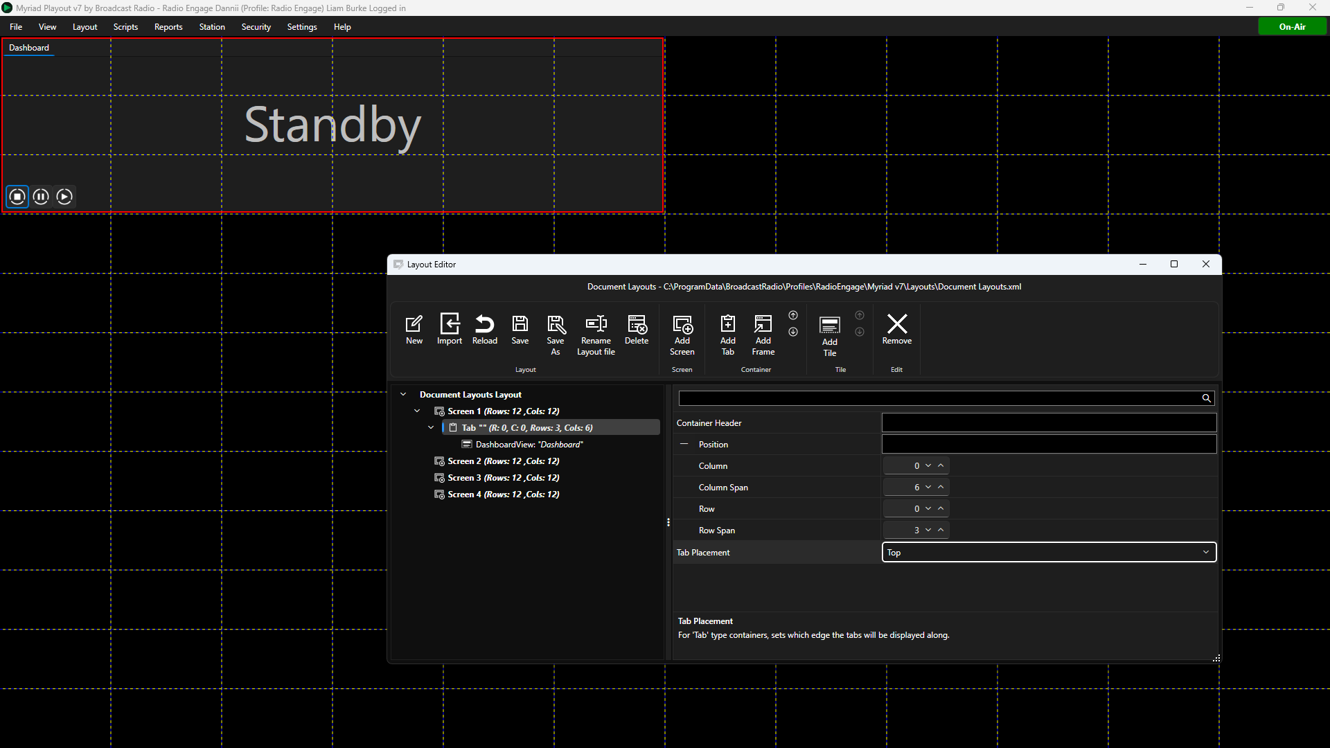
To add another Tile to a Tabbed Container, select the Tabbed Container and click on the Add Tile button.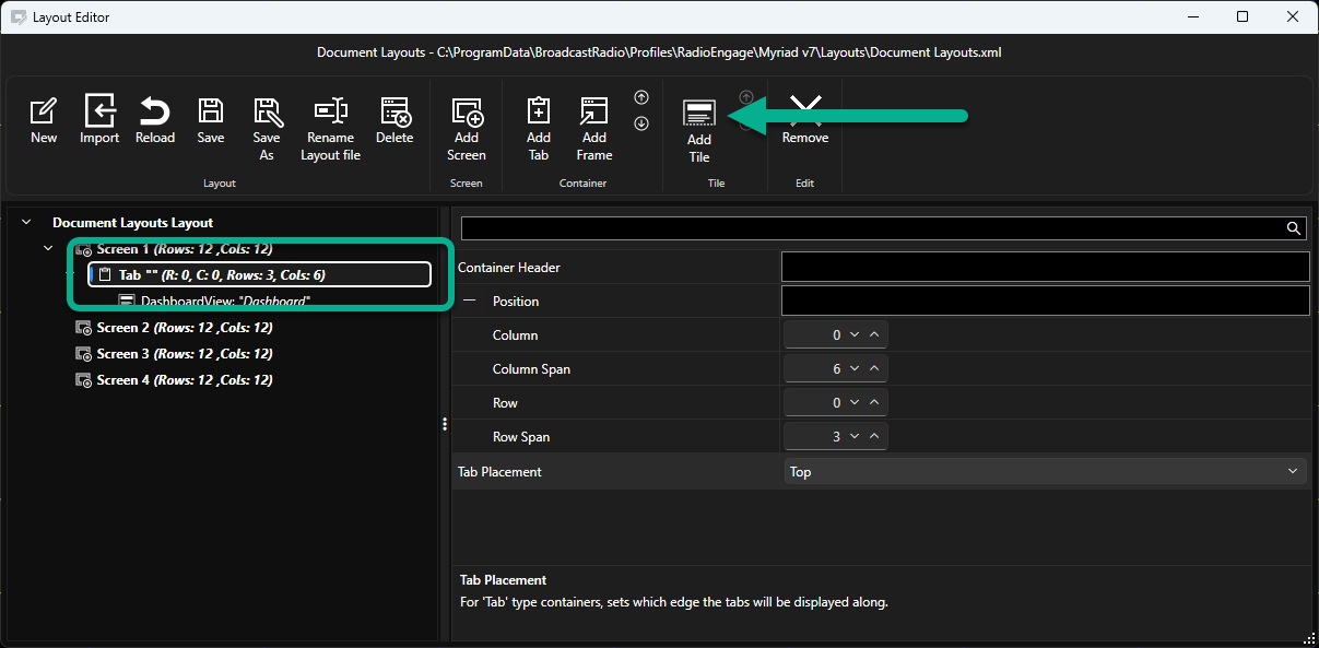
Select the Tile you want to add and click OK.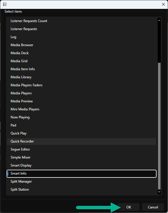
The new Tile will be added to the Navigation panel under the Tabbed Container and the Tab will be added to the preview on the grid.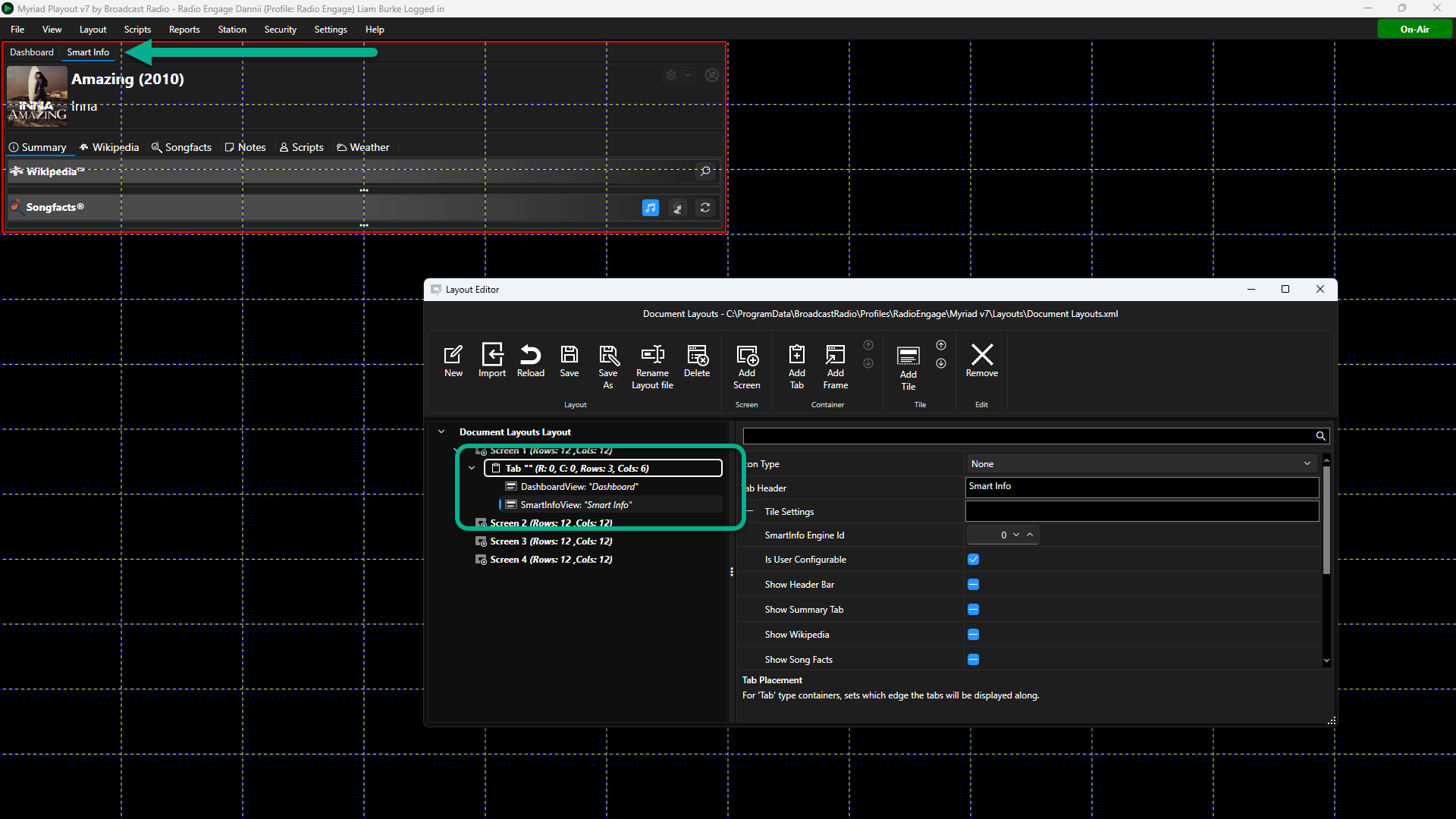
If you want to change the order of Tiles within a Tabbed Container, select the Tile you want to move and click on the Up/Down button in the Tile section in the ribbon.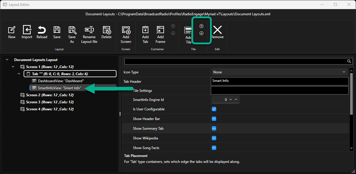
Tile Properties
In this section we will outline the top level properties for the available Tiles in Myriad 7.
Custom Date and Time Format Specifiers
Custom Date and Time Format Specifiers are short codes used to control how dates and times are displayed. Each code represents a particular part of a date or time, such as the day, month, year, hour or minute. You can combine these codes with separators and other text to create the format you need. For example, dd/MM/yyyy displays a date as 22/09/2026, while HH:mm:ss displays a time as 11:45:30. The number and capitalisation of letters is important — for example, MM represents the month, while mm represents minutes.
These codes are used in Tiles to allow you to configure how Dates and Times are displayed in your Layout.
| Format | Description | Example |
|---|---|---|
d | Day of the month, 1–31 | 1, 15 |
dd | Day of the month, 01–31 | 01, 15 |
ddd | Abbreviated day name | Mon |
dddd | Full day name | Monday |
g or gg | Period or era | A.D. |
h | Hour using a 12-hour clock, 1–12 | 1 |
hh | Hour using a 12-hour clock, 01–12 | 01 |
H | Hour using a 24-hour clock, 0–23 | 13 |
HH | Hour using a 24-hour clock, 00–23 | 13 |
K | Time-zone information | Z, +01:00, -07:00 |
m | Minute, 0–59 | 9, 45 |
mm | Minute, 00–59 | 09, 45 |
M | Month, 1–12 | 6 |
MM | Month, 01–12 | 06 |
MMM | Abbreviated month name | Jun |
MMMM | Full month name | June |
s | Second, 0–59 | 9 |
ss | Second, 00–59 | 09 |
t | First character of the AM/PM designator | A, P |
tt | AM/PM designator | AM, PM |
y | Year, 0–99 without leading zero | 9, 19 |
yy | Two-digit year | 09, 19 |
yyy | Year with a minimum of three digits | 009, 2009 |
yyyy | Four-digit year | 2009 |
yyyyy | Five-digit year | 02009 |
z | UTC hour offset without leading zero | -7 |
zz | UTC hour offset with leading zero | -07 |
zzz | UTC hour and minute offset | -07:00 |
: | Time separator | 13:45 |
/ | Date separator | 15/06/2009 |
"string" or 'string' | Inserts literal text into the formatted result | "at" HH:mm → at 13:45 |
% | Treats the following character as a single custom format specifier | %h → 1 |
\ | Escape character used to include a character literally | h \h → 1 h |
| Any other character | Copied into the result unchanged | HH:mm hrs → 13:45 hrs |
Useful examples.
| Format | Example Output |
|---|---|
dd/MM/yyyy | 15/06/2009 |
dd/MM/yy | 15/06/09 |
ddd dd MMM yyyy | Mon 15 Jun 2009 |
dddd d MMMM yyyy | Monday 15 June 2009 |
HH:mm | 13:45 |
HH:mm:ss | 13:45:30 |
h:mm tt | 1:45 PM |
dd/MM/yyyy HH:mm | 15/06/2009 13:45 |
yyyy-MM-dd | 2009-06-15 |
yyyy-MM-dd HH:mm:ss | 2009-06-15 13:45:30 |
Audio Monitor Tile
Used to display audio VU levels for confidence monitoring.
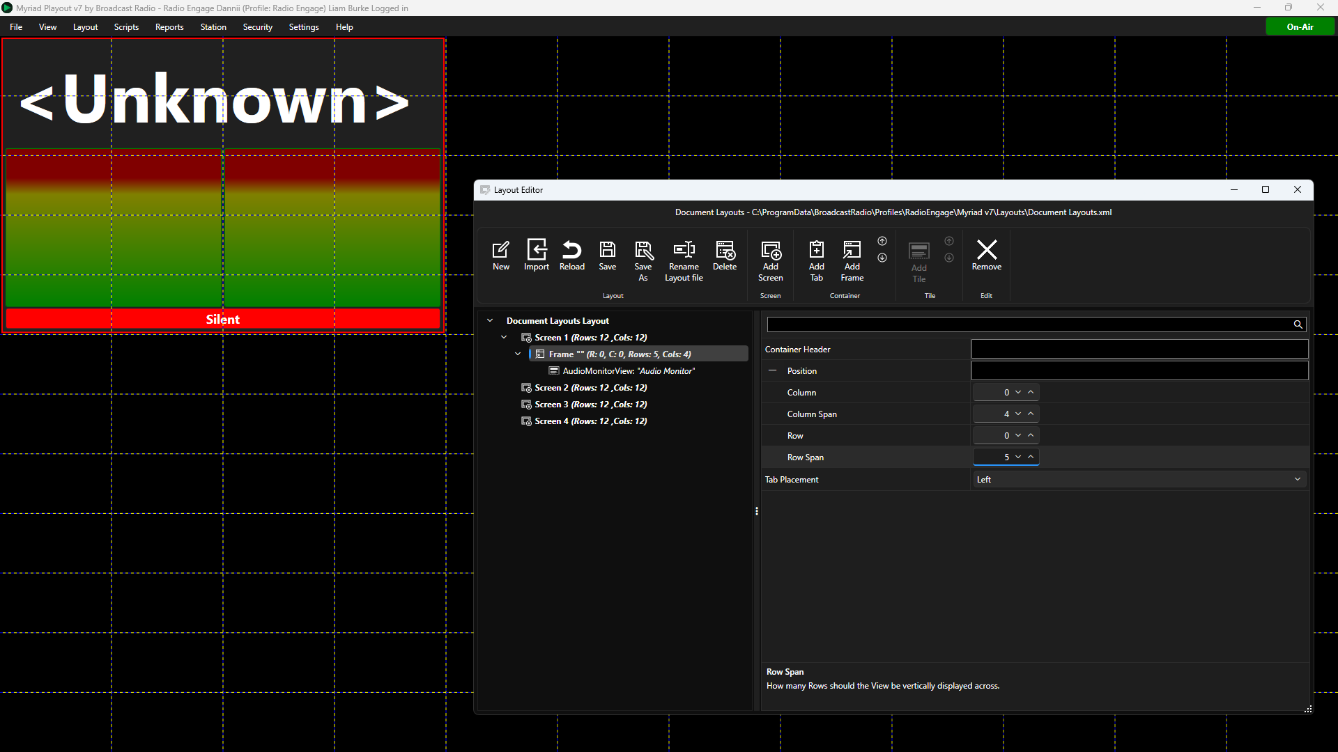
- Icon Type - Sets whether to display a icon on the Tile or not.
- Tab Header - Sets the Text to display on Tabs if placed in a Tabbed Container.
- Edit Monitor Settings - Opens a dedicated page of settings to allow you to configure the audio monitoring software (see below).
- Background Colour -Sets the background colour for the Tile. Use the colour picker or type in a color hex code. Please note the hex color code consists of two characters for alpha transparency (FF opaque to 00 for transparency) plus six characters for colour.
- Orientation - Set vertical or horizontal orientation for VU bars.
- Show Connection Caption - Display the connection status caption on the Tile.
- Show Silent Alert - Show Silent caption when silence conditions are triggered.
- Text Color - Set the text colour using the colour picker or an 8 digit hex code.
When you click on the Edit Audio Monitor Settings button a dedicated Audio Monitor Settings window will open.
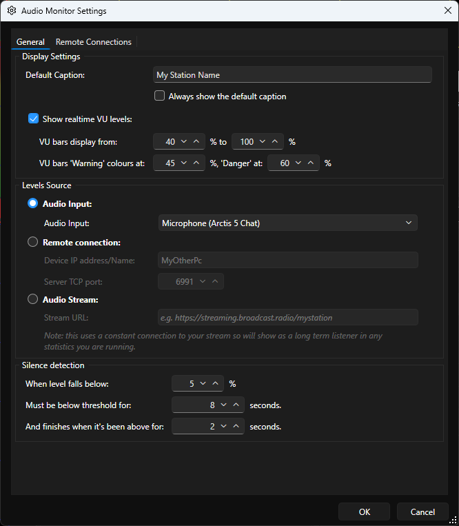
- Default Cation - Caption to display on Audio Monitor.
- Show Realtime VU Levels - Tick to enable VUs.
- VU Bars Display From - Set the range that the VU's display (allows you to filter out low level).
- VU Bars Warning Colours At - Set the threshold for colour warnings on VU.
- Audio Input - Select a local sound device if that is the audio source you want to use.
- Remote Connection - Set the IP Address / PC name and Port for connecting to a remote PC running the free Broadcast Radio Audio Monitor tool.
- Audio Stream - Set the URL for a stream to set it as the audio monitor source.
- Silence Detection - Set the silence level threshold and the duration below the threshold to trigger the silence alert. Also set the duration above the threshold needed to cancel the silence alert.
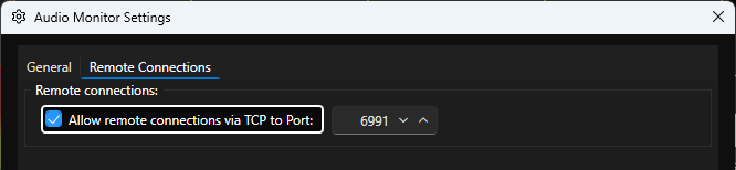
- Remote Connections Tab - Allows Remote Connections via TCP to Port xxxx allows you to set the port other PC's can use to connect to audio monitoring on this PC.
Auto Player Tile
This Tile displays the AutioPlayer which can be used to automatically play content at scheduled times. You must of AutoPlay enabled in your Myriad License in order to use this Tile in your layout.
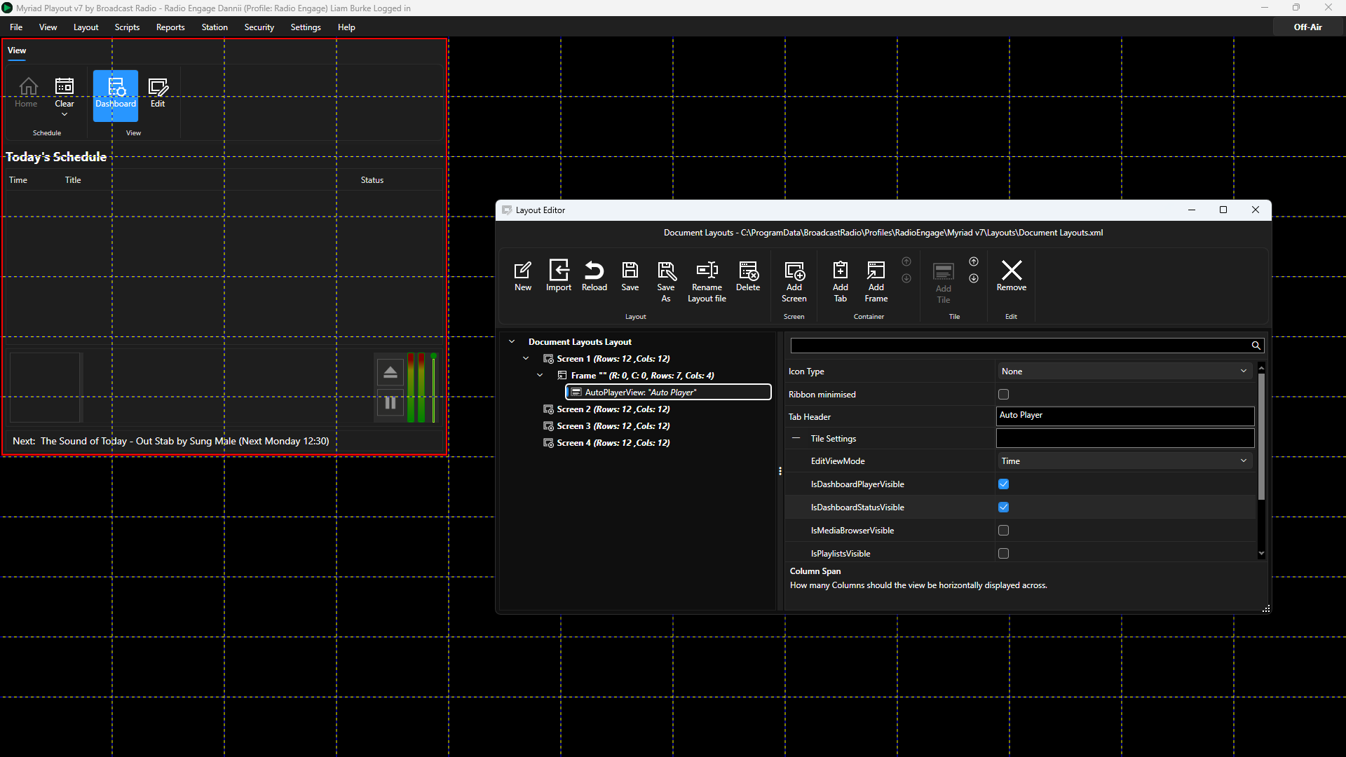
- Icon Type - Sets whether to display a icon on the Tile or not.
- Ribbon Minimised - Sets whether the ribbon is minimised on the Tile. If ticked, the User will have to click to access the ribbon.
- Tab Header - Sets the Text to display on Tabs if placed in a Tabbed Container.
- Edit View Mode - Allows you to set the edit view node to Time or List - See Auto Player documentation for more details.
- Is Dashboard Player Visible - Toggles whether to show a summary panel at the bottom of the Tile (not related to the Dashboard Tile in Myriad).
- Is Dashboard Status Visible - Toggles whether to display a text summary of next Auto Player action at the bottom of the Tile.
- Is Media Browser Visible - Toggles whether to show the Media Browser when Auto Player is in Edit mode.
- Is Playlist Visible - Toggles whether to display the Playlist tab when in Auto Player is in Edit mode.
- View Mode - Switch view between Dashboard and Edit mode.
Clock Tile
The Clock Tile allows you to add a Clock and/or Date Tile to your layout with various display options.
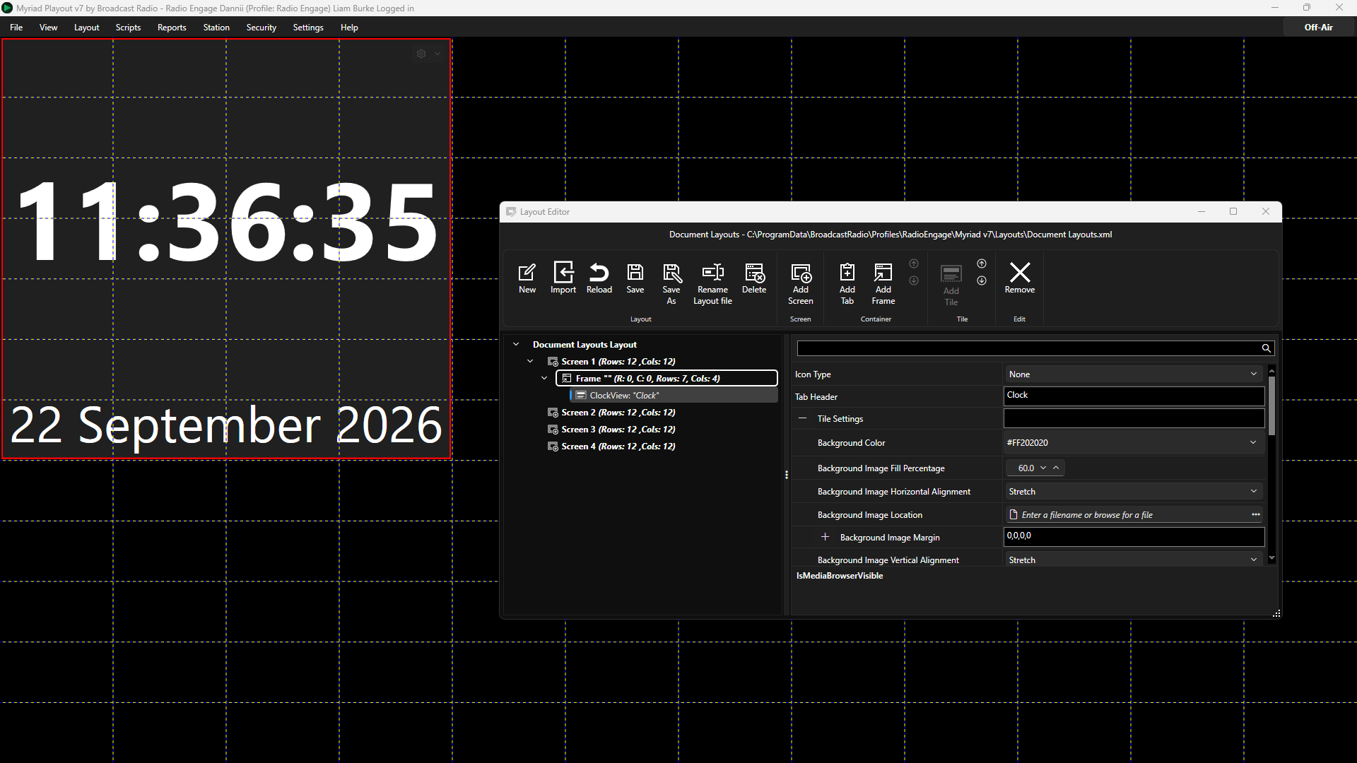
- Icon Type - Sets whether to display a icon on the Tile or not.
- Tab Header - Sets the Text to display on Tabs if placed in a Tabbed Container.
- Background Colour -Sets the background colour for the Tile. Use the colour picker or type in a color hex code. Please note the hex color code consists of two characters for alpha transparency (FF opaque to 00 for transparency) plus six characters for colour.
- Background Image Fill Percentage - Scale the optional image size as a percentage.
- Background Image Horizontal Alignement - Sets the alignment of the optional image. Options are Left, Centre, Right or Stretch.
- Background Image Location - Browse to select the image you want to display in your Clock.
- Background Image Margin - Set the offset from clock center to position image. Margin set in pixels as left, top, right, bottom.
- Background Image Vertical Alignement - Sets the alignment of the optional image. Options are Top, Centre, Bottom or Stretch.
By combining these attributes, it is possible to scale and position a logo to be displayed within the Clock Tile.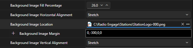
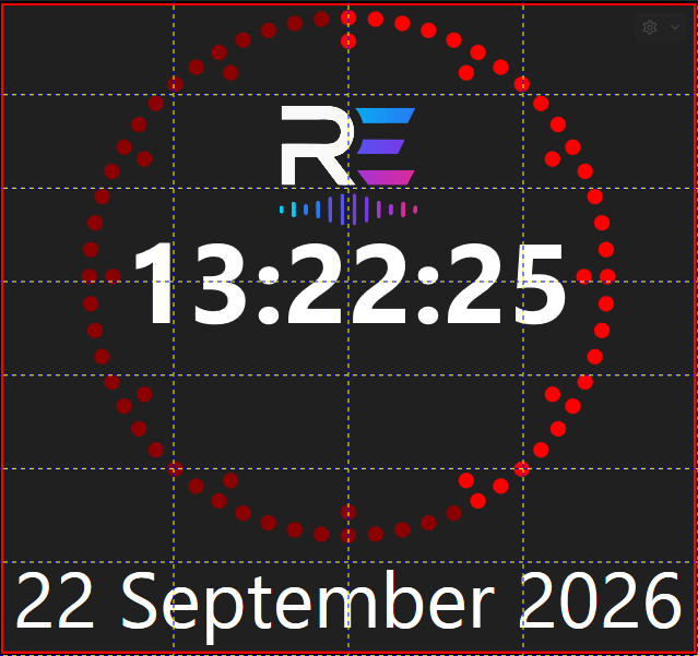
Results in the clock below (with Show Second Ticks enabled).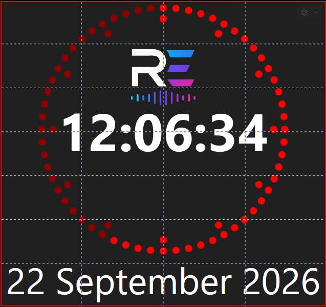
- Countdown Format - Allows you to set the format for the time display if the Clock is in countdown mode (see Custom Date & Time Format Specifiers).
- Date Format - Allows you to specify the format used to display the Date (see Custom Date & Time Format Specifiers).
- Date Position - Sets where Date is displayed. Option are Bottom, Below Time (when Show Seconds Tick option is selected) or Not Shown.
- Force Clock Mode - Allows you to force a Clock to display Time or Countdown. Option are Clock, Countdown or Null (for not forced).
- Lock to Station ID - Locks the Clock to a specific Station ID number. If set to -1, the Clock will use the open Station (recommended).
- Second Tick Colour Off - Select the colour for the unused seconds when Show Second Ticks are enabled. Use the colour picker to select the colour. In the example below, this property sets the colour for the darker red seconds that are still to come in the current minute.
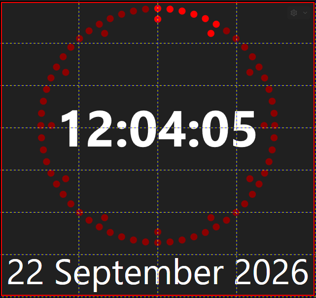
- Second Tick Colour On - Select the colour for the used seconds when Show Second Ticks are enabled. Use the colour picker to select the colour. In the example above, this property sets the colour for the light red seconds that have already passed in the current minute.
- Show Preference - Toggles whether to display the options button in the top right to allow users to switch between Clock and Countdown mode.
- Show Second Ticks - This option sets whether to display circle of sixty 'ticks' around the time, counting up the the seconds in the current minute.
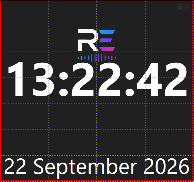
- Show Time - Toggles whether to display time (turn off for dedicated date displays).
- Show Station Logo - Ticking this option will display the Station Logo (Settings Menu > Database Settings > Stations Tab > Station Details and Features). This will override the Background Image Location setting.
- Show Time As Text - This option replaces the standard digital clock with a 'time as text' clock ie Twenty minutes to four.
- Text Color - Set the text colour using the colour picker or an 8 digit hex code.
- Time Format - Set the format to display the time (see Custom Date & Time Format Specifiers).
- Time Zone ID - Choose your timezone from the drop down list.
You may also be interested in Using the Dynamic Layout Editor In Myriad 7
Dashboard Tile
The Dashboard Tile allows you to add the Dashboard to your layout. The Dashboard shows the currently playing item and the next few items to play, when in Live or AutoFade modes.
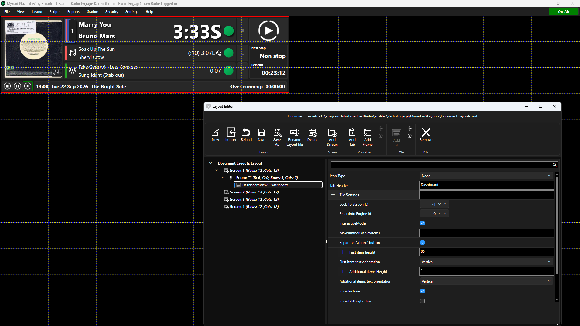
- Icon Type - Sets whether to display a icon on the Tile or not.
- Tab Header - Sets the Text to display on Tabs if placed in a Tabbed Container.
- Lock to Station ID - Locks the Tile to a specific Station ID number. If set to -1, the Clock will use the open Station (recommended).
- SmartInfo Engine ID - This allows you to target Smart Info panels using the same ID, for example, having a Smart Into that always shows only Dashboard information.
- Interactive Mode - Toggle whether the Dashboard Tile is interactive or only for display purposes.
- Max Number Of Display Items - The settings allows you to lock the number of items displayed in the Dashboard. If left blank, the Dashboard will display the number of items configured in Myriad (see Station Menu > Station Settings > Schedule log Tab > Number of items to ahead to pre-cue).
- Separate Action Buttons - Enables Action buttons to right of Dashboard items as opposed to combined with Player Number.
- First Item Height - Set the height of the first item (the now playing item) in the Dashboard.
- First Item Text Orientation - Choose between Vertical (vertically stack Title & Artist over two lines.) or Horizontal (horizontally display Tile / Artist on a single line).
- Show Picture - Toggle whether to display album art of the currently playing item, to the left of the Dashboard. Station Logo is shown when album art is not available.
- Show Edit Log Button - Enables a button that can be used to open a floating window containing the Log (ideal for Layouts that do not include a Log view).
- Show Open Players Button - Enabled a button that can be used to open a floating window containing the Media Players (ideal for layouts without a Media Player view).
- Combine Mode Buttons - Toggle whether to use a single 'drop down' button for Standby / Live / Autofade (like in Myriad 5/6) or separate buttons for Standby, Live and Autofade modes.
Encoder Tile
The Encoder Tile can be used in conjunction with the Broadcast Radio Encoder software to display encoder status and enable Encoder control from directly within Myriad Playout.
Please note, you need to configure Myriad to connect to your BR Encoder software (see Station Menu > Station Settings > Connections)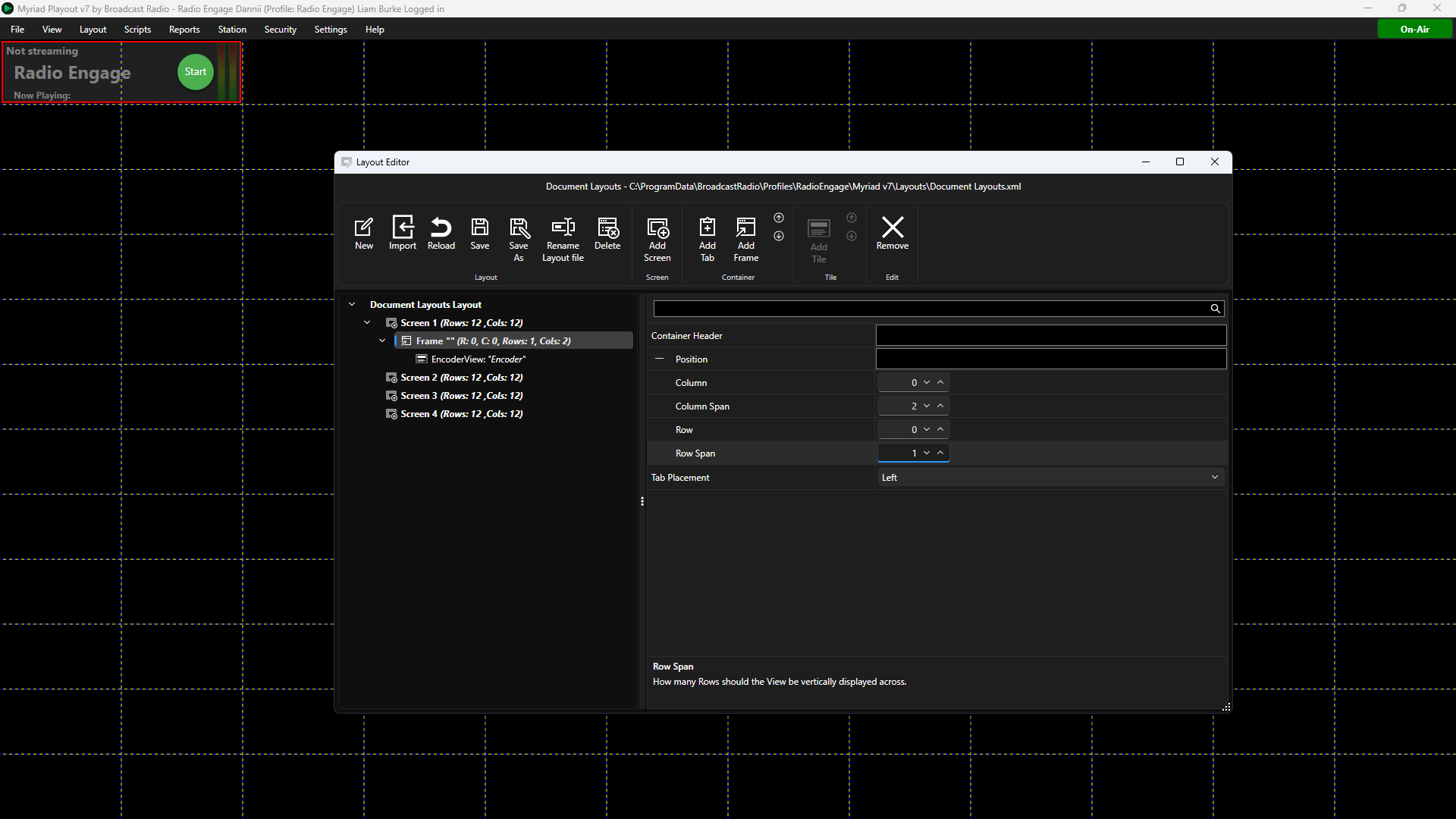
- Icon Type - Sets whether to display a icon on the Tile or not.
- Tab Header - Sets the Text to display on Tabs if placed in a Tabbed Container.
- Background Colour -Sets the background colour for the Tile. Use the colour picker or type in a color hex code. Please note the hex color code consists of two characters for alpha transparency (FF opaque to 00 for transparency) plus six characters for colour.
- EncoderNumber - Allows you to have multiple Encoder Tiles connected to different Encoders.
- Lock to Station ID - Locks the Tile to a specific Station ID number. If set to -1, the Clock will use the open Station (recommended).
- Show Gradient Overlay - Adds a graphical overlay to the Encoder Tile.
- Show Start Stop Button - Toggle whether the Start / Stop buttons are visible in the Tile.
- Text Color - Set the text colour using the colour picker or an 8 digit hex code.
Favourites Tile
Adds access to your Favourite Sets from within the Layout. Favourites provide hotkey or one click access to commonly used Media.
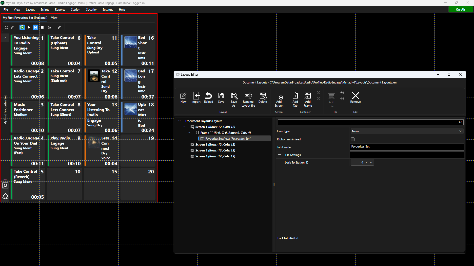
- Icon Type - Sets whether to display a icon on the Tile or not.
- Ribbon Minimised - Sets whether the ribbon is minimised on the Tile. If ticked, the User will have to click to access the ribbon.
- Tab Header - Sets the Text to display on Tabs if placed in a Tabbed Container.
- Lock to Station ID - Locks the Tile to a specific Station ID number. If set to -1, the Clock will use the open Station (recommended).
HTML Display Tile
The HTML Display can be used to add a simple webpage to a Myriad Layout, which is automatically refreshed at configurable interval.
IMPORTANT - This feature is designed to display simple information such as local traffic internal station information. It is not a fully featured web browser and will not display complex web pages. You should never use this feature to display advanced pages such as Facebook!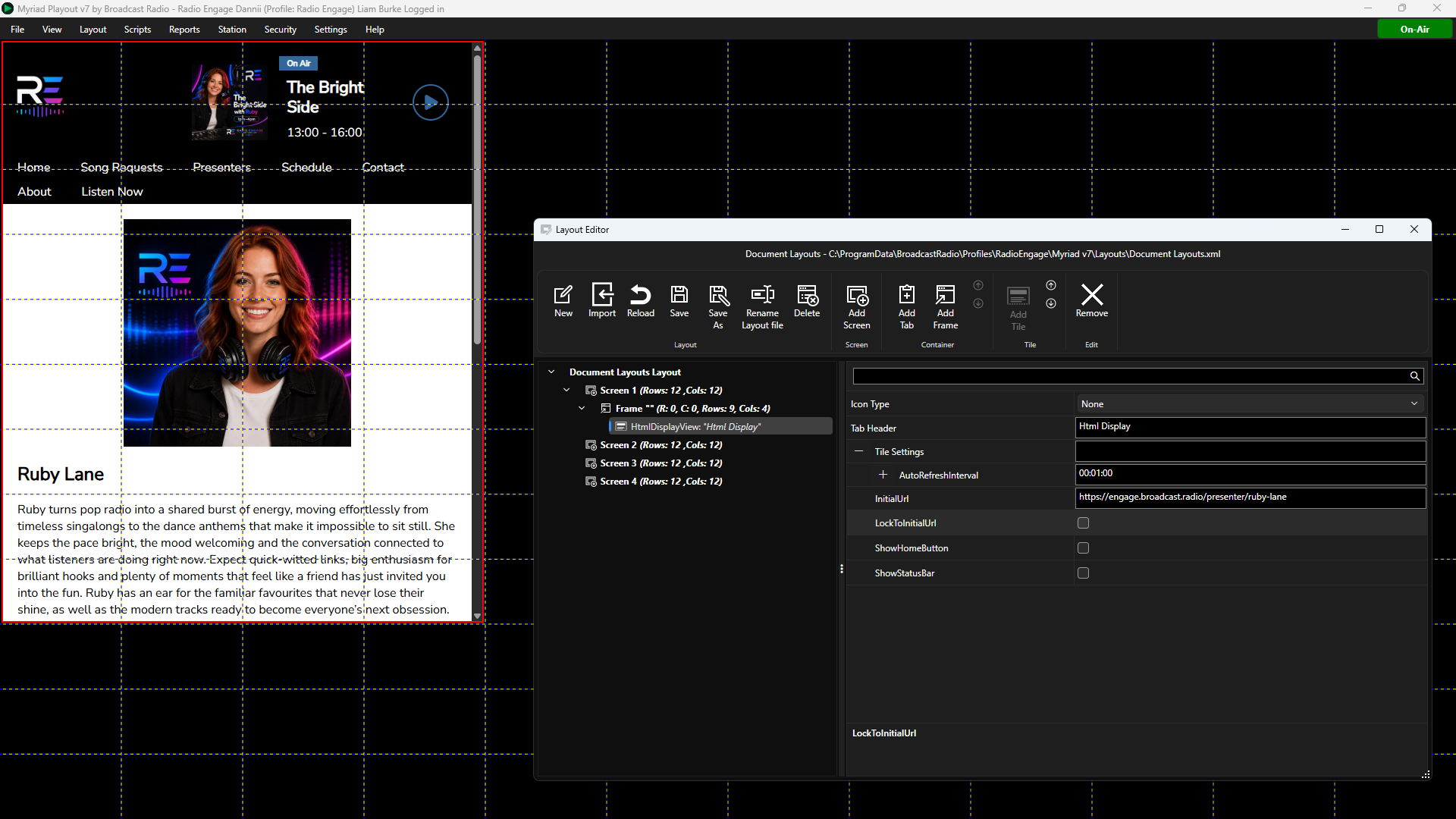
- Icon Type - Sets whether to display a icon on the Tile or not.
- Tab Header - Sets the Text to display on Tabs if placed in a Tabbed Container.
- Auto Refresh Interval - Check how often to check the website for changes.
- Initial URL - Set the address for the HTML page you want to display.
- Lock Initial URL - Do not let Users click on links to other pages (recommended).
- Show Home Button - Toggle whether to display a Home button (returns to initial URL).
- Show Status Bar - Toggles whether to show a bar at the bottom of the Tile with the time and date of most recent update.
Listener Request Count Tile
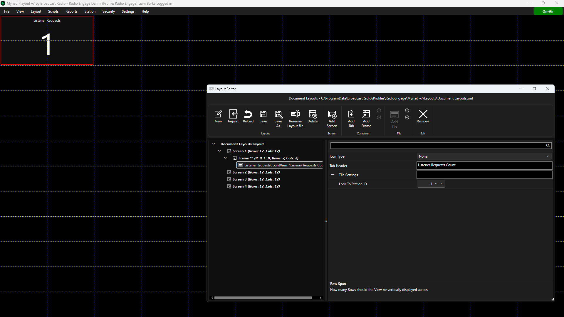
The Listener Request Count Tile displays the number of Listener Requests awaiting approval.
- Icon Type - Sets whether to display a icon on the Tile or not.
- Tab Header - Sets the Text to display on Tabs if placed in a Tabbed Container.
- Lock to Station ID - Locks the Tile to a specific Station ID number. If set to -1, the Clock will use the open Station (recommended).
Listener Requests Tile
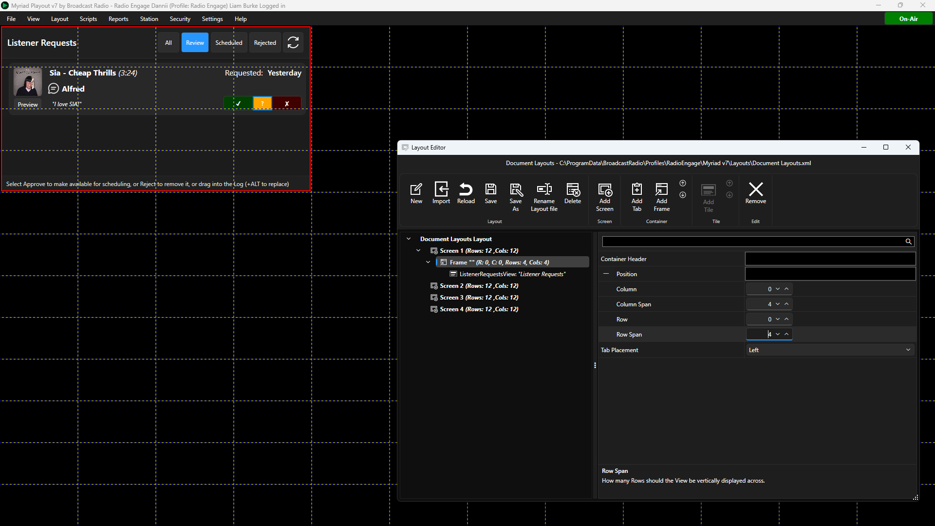
The Listener Request Tile is used to display the current Listener Requests queues. This can be used to browse and approve Listener Requests or manually add the to the Log (or Media Players).
- Icon Type - Sets whether to display a icon on the Tile or not.
- Tab Header - Sets the Text to display on Tabs if placed in a Tabbed Container.
- Lock to Station ID - Locks the Tile to a specific Station ID number. If set to -1, the Clock will use the open Station (recommended).
Log Tile
The Log Tile adds the Log View to your layout.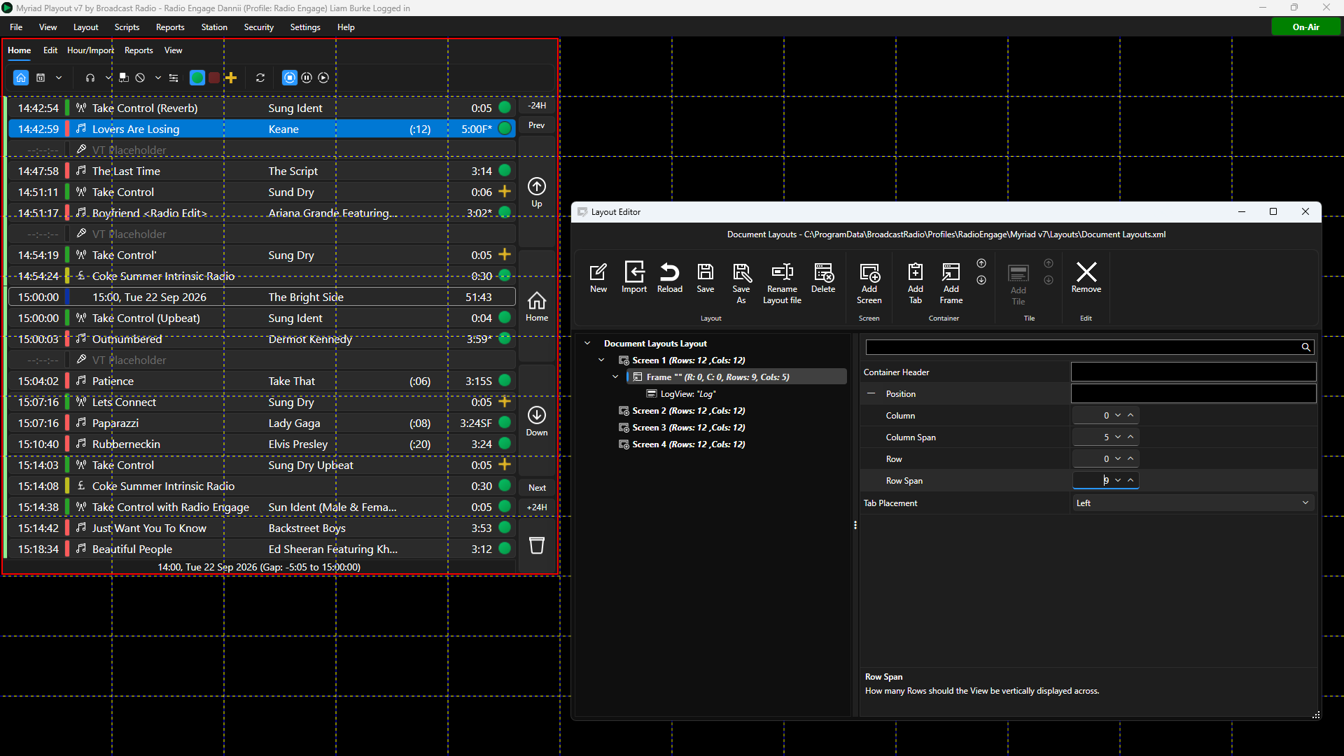
- Icon Type - Sets whether to display a icon on the Tile or not.
- Ribbon Minimised - Sets whether the ribbon is minimised on the Tile. If ticked, the User will have to click to access the ribbon.
- Tab Header - Sets the Text to display on Tabs if placed in a Tabbed Container.
- Lock to Station ID - Locks the Tile to a specific Station ID number. If set to -1, the Clock will use the open Station (recommended).
- Send Highlight Item Notification - Toggle whether highlighted item is used to update Smart Info Tiles.
- Show Playback Mode Buttons - Toggles whether to display the Standby / Live / AutoFade buttons on the ribbon.
- SmartInfo Engine ID - This allows you to target Smart Info Tiles using the same ID, for example, having a Smart Into that always shows only Log information.
Media Browser Tile
The Media Browser Tile is used to add a Media Browser to your layout. The Media Browser is a cutdown version of the Media Grid (Media Wall) used for browsing and selecting Media Items.
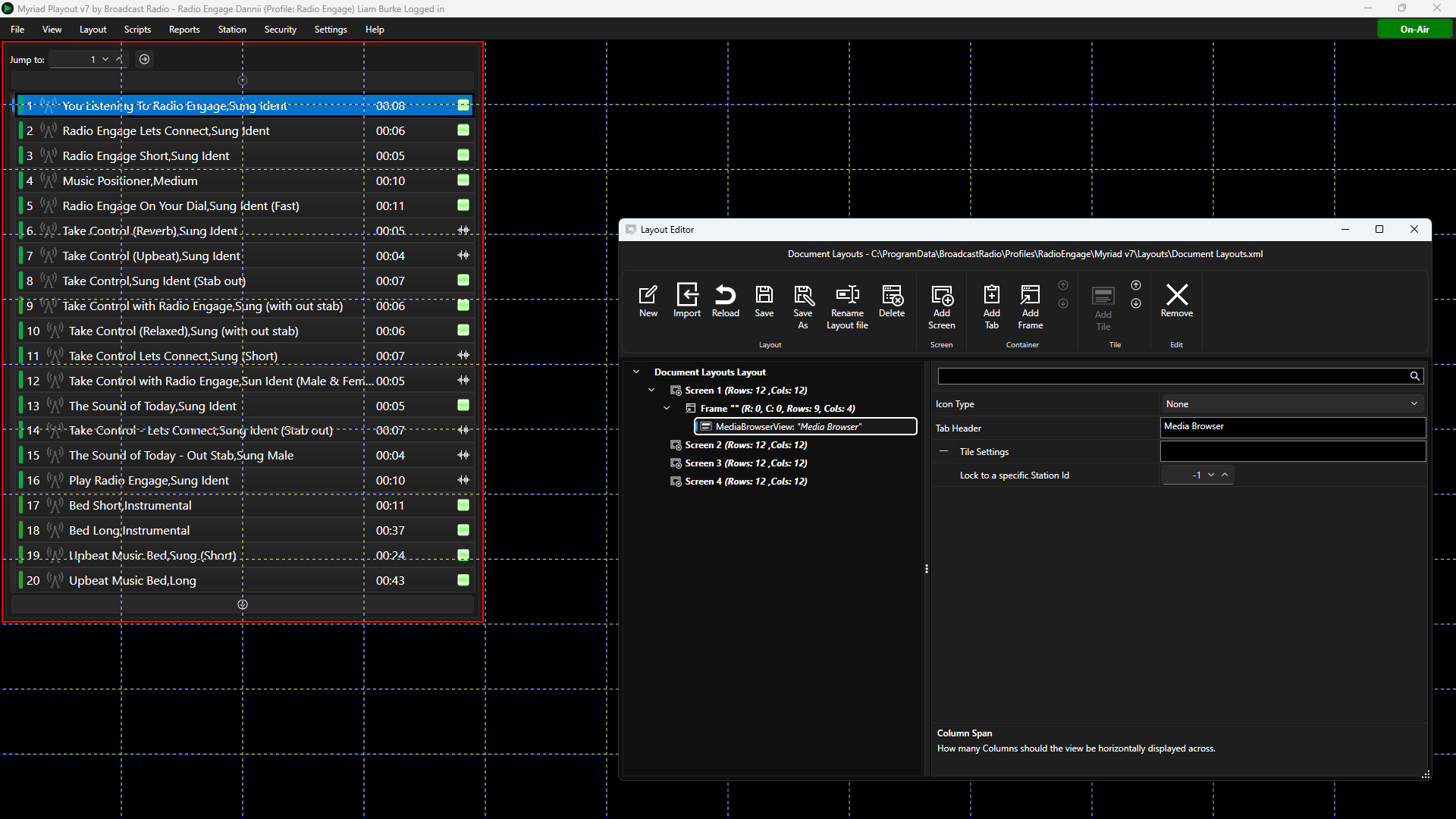
- Icon Type - Sets whether to display a icon on the Tile or not.
- Tab Header - Sets the Text to display on Tabs if placed in a Tabbed Container.
- Lock to Station ID - Locks the Tile to a specific Station ID number. If set to -1, the Clock will use the open Station (recommended).
Media Deck Tile
The Media Deck Tile adds access to your Myriad Schedule Category Decks from within your layout.
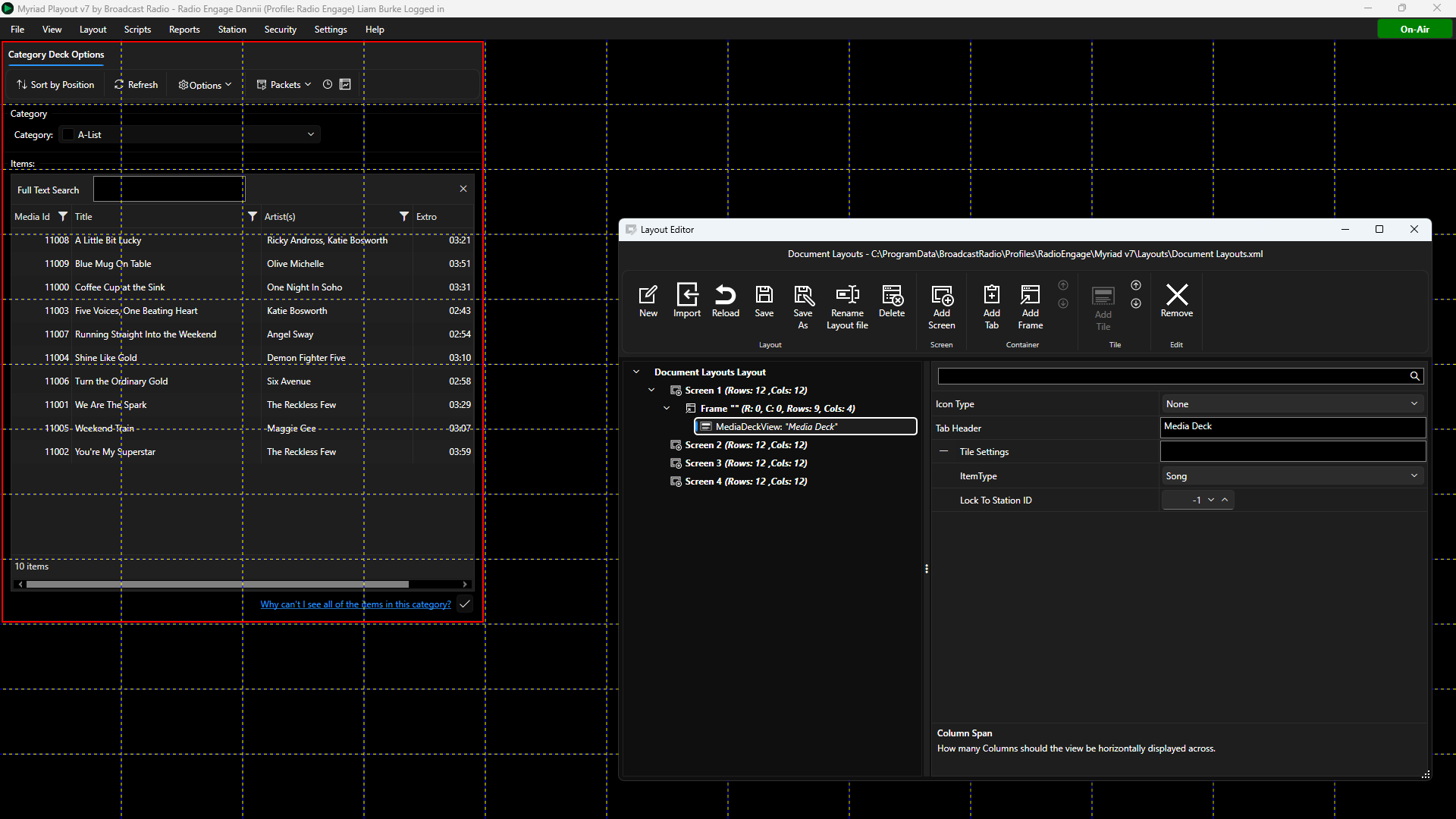
- Icon Type - Sets whether to display a icon on the Tile or not.
- Tab Header - Sets the Text to display on Tabs if placed in a Tabbed Container.
- Item Type - You can select the Item Type to display (Song, Links, Adverts etc) which will determine which Category Decks are displayed.
- Lock to Station ID - Locks the Tile to a specific Station ID number. If set to -1, the Clock will use the open Station (recommended).
Media Grid (Media Wall) Tile
The Media Grid Tile is used to add a Media Wall to your layout. This can be used to visually browse and use the Media on your Myriad system.
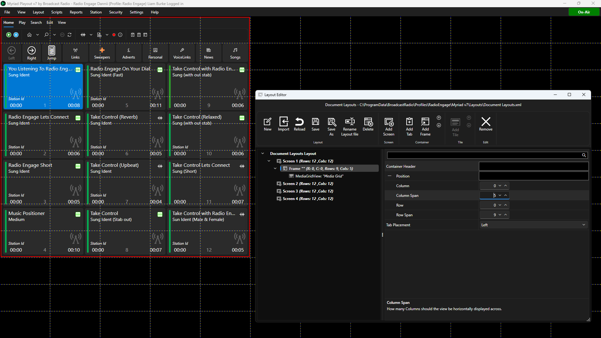
- Icon Type - Sets whether to display a icon on the Tile or not.
- Ribbon Minimised - Sets whether the ribbon is minimised on the Tile. If ticked, the User will have to click to access the ribbon.
- Tab Header - Sets the Text to display on Tabs if placed in a Tabbed Container.
- Lock to Station ID - Locks the Tile to a specific Station ID number. If set to -1, the Clock will use the open Station (recommended).
- Show Edit Item - Toggles whether the Edit Media Item button should be displayed when a User hovers the mouse over an empty Media Item.
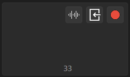
- Show Import Item - Toggles whether the Import Media Item button should be displayed when a User hovers the mouse over an empty Media Item.
- Show Record Item - Toggles whether the Record button should be displayed when a User hovers the mouse over an empty Media Item.
- SmartInfo Engine ID - This allows you to target Smart Info Tiles using the same ID, for example, having a Smart Into that always shows only Log information.
Media Info Tile
The Media Info Tile allows you to show Media Info in your layout. Media Info shows additional information such as recent play information and schedule warnings, for items selected in the Library, Media Wall or Log.
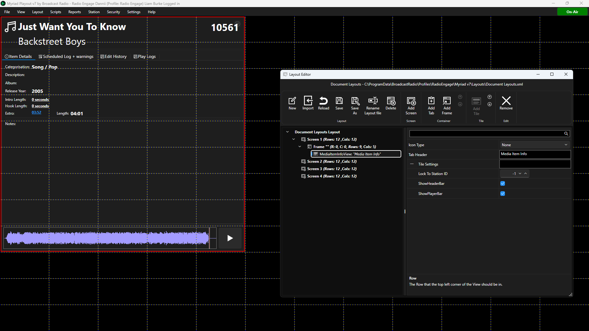
- Icon Type - Sets whether to display a icon on the Tile or not.
- Tab Header - Sets the Text to display on Tabs if placed in a Tabbed Container.
- Lock to Station ID - Locks the Tile to a specific Station ID number. If set to -1, the Clock will use the open Station (recommended).
- Show Header Bar - Toggle whether to show the summary bar at the top of the Tile.
- Show Player Bar - Toggle whether to show the Player bar at the bottom of the Tile.
Library Tile
You can add a Library view to your layout using the Library Tile.
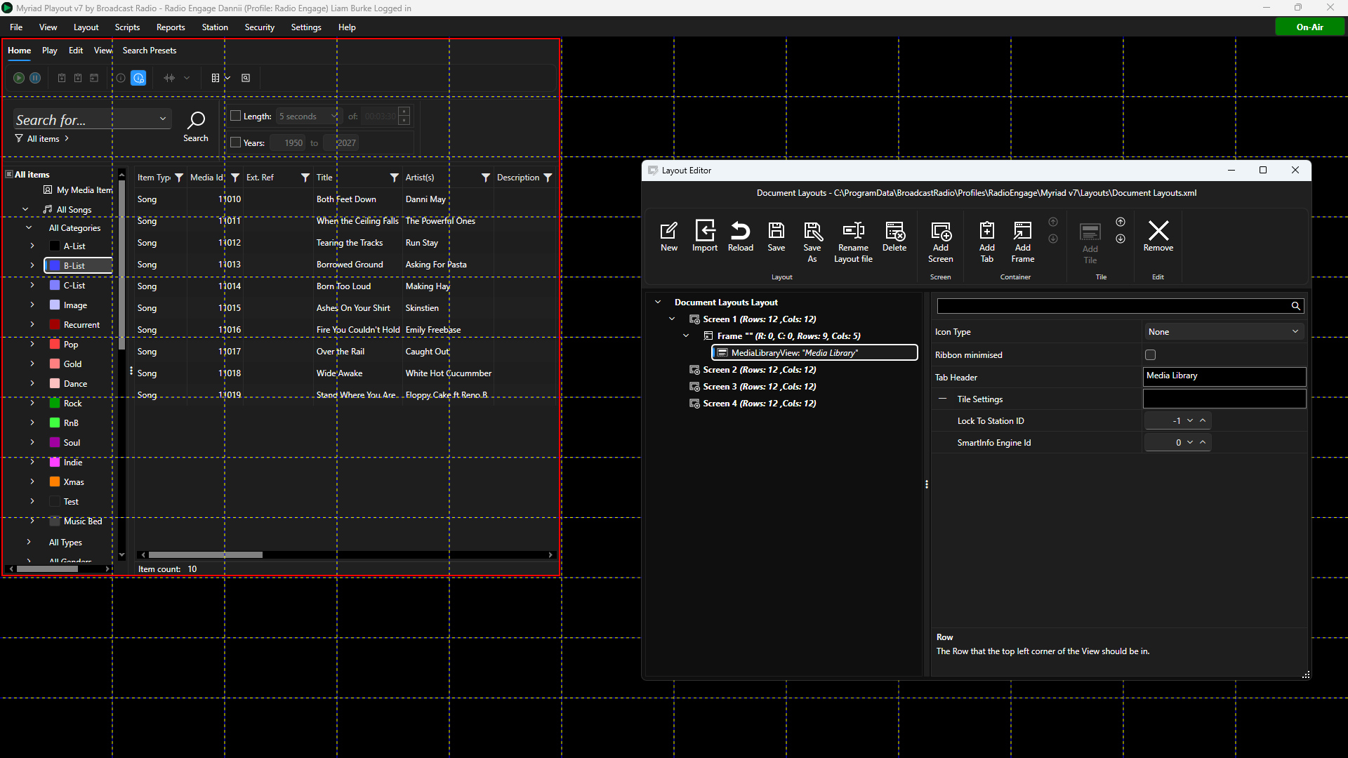
- Icon Type - Sets whether to display a icon on the Tile or not.
- Ribbon Minimised - Sets whether the ribbon is minimised on the Tile. If ticked, the User will have to click to access the ribbon.
- Tab Header - Sets the Text to display on Tabs if placed in a Tabbed Container.
- Lock to Station ID - Locks the Tile to a specific Station ID number. If set to -1, the Clock will use the open Station (recommended).
- SmartInfo Engine ID - This allows you to target Smart Info Tiles using the same ID, for example, having a Smart Into that always shows only Library information.
Media Player Faders Tile
The Media Player Faders Tile can be used to add dedicated graphical faders to your layout, which can be used to control playback volume on your Media Players. Useful if you are using this layout in a location without a physical mixing desk.
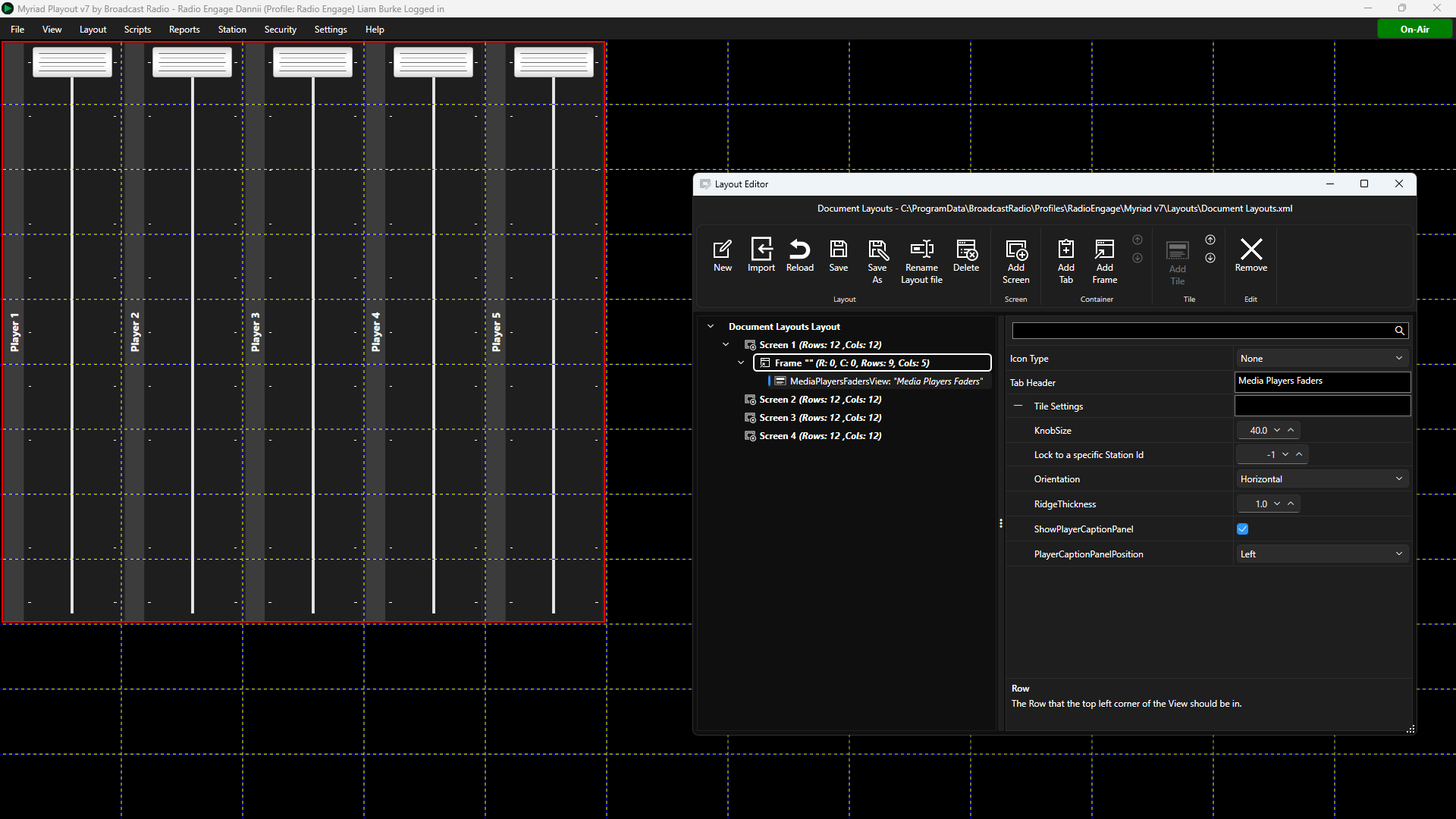
- Icon Type - Sets whether to display a icon on the Tile or not.
- Tab Header - Sets the Text to display on Tabs if placed in a Tabbed Container.
- Knob Size - Set the size (in pixels) for the fader knob.
- Lock to Station ID - Locks the Tile to a specific Station ID number. If set to -1, the Clock will use the open Station (recommended).
- Orientation - Set the layout of the fader 'bank' to be horizontal or vertical.
- Ridge Thickness - Set the line thickness providing the 'texture' on the knobs.
- Show Player Caption Panel - Toggle whether to include the Media Player Caption for each fader.
- Player Caption Panel Position - Select the position of the Player Caption (left, top, right, bottom) if enabled.
Media Players Tile
The Media Players Tile is used to position the Media Players within your layout.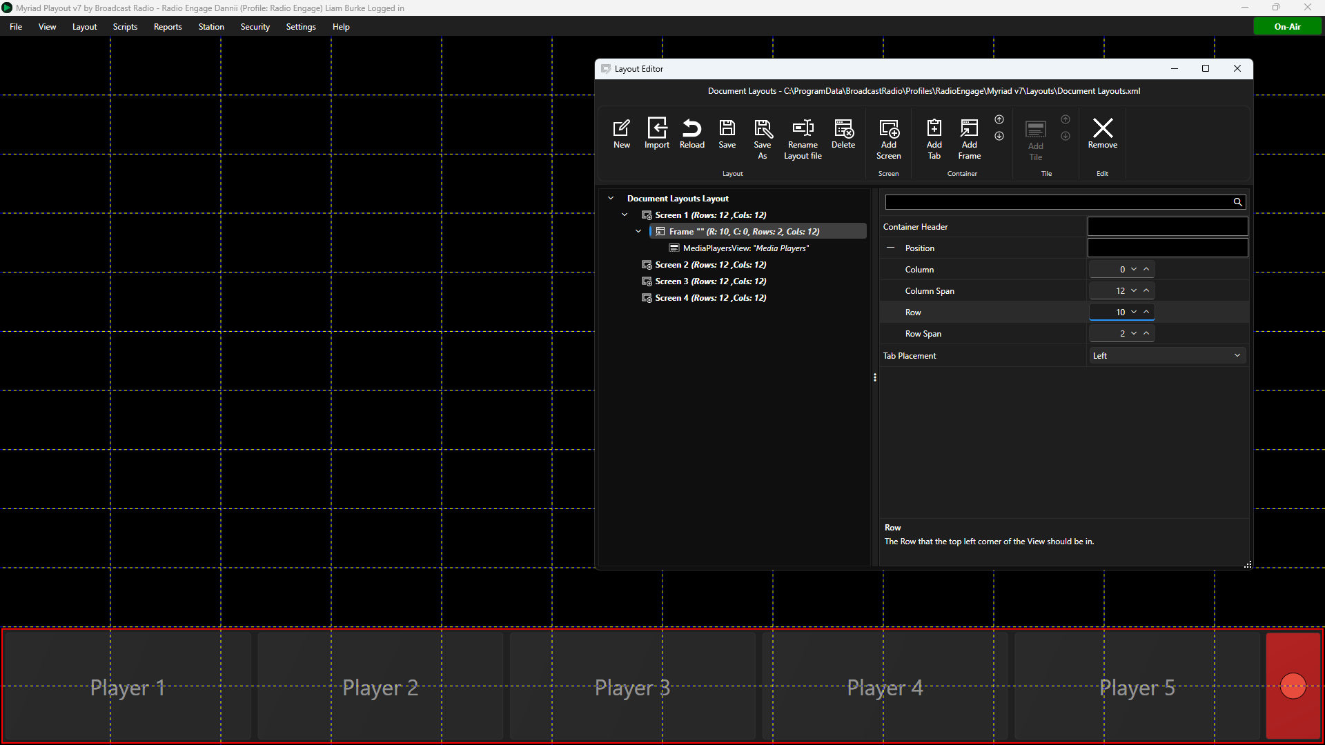
- Icon Type - Sets whether to display a icon on the Tile or not.
- Tab Header - Sets the Text to display on Tabs if placed in a Tabbed Container.
- First Visible Player - All Media Players below the 'first visible player' are excluded from this Tile. You can use this to have several different Media Player Tiles within a layout, showing different Media Players.
- Knob Size - Set the knob size (in pixels) for the volume control fader (when enabled).
- Last Visible Player - All Media Players above the 'last visible player' are excluded from this Tile. You can use this to have several different Media Player Tiles within a layout, showing different Media Players.
- Lock to Station ID - Locks the Tile to a specific Station ID number. If set to -1, the Clock will use the open Station (recommended).
- Orientation - Set whether to stack the Media Players horizontally or vertically.
- Overlay Titles Over Waveform - Toggle whether to display the waveform in the background with the Title and Artists text layered over the top or scale the waveform so it sits below the Media Item text.
- Show ' Jump to this Media Item..' Right Click Menu - Toggle whether to include a Jump to Media Item option on the right click menu for the Media Player.
- Show Progress On Waveform - Toggle whether to use a coloured fill on the wave form when playing. This also paces Media Item text into an opaque box so it remains readable while the waveform fills.
- Show Player Captions When Empty - Toggles whether to display Player Captions (Player 1 etc) when the Media Players are empty or leave them blank.
- Show Players - Toggle whether to show Media Players in this Tile.
- Show Recorder - Toggle whether to show the Recorder in this Tile.
- Show Outline When Playing - Toggle option to highlight playing Media Players by applying an outline to the player.
- Outline Colour When Playing - If the option to outline playing Media Players is enabled, you can select the colour of the outline using the colour picker or adding an eight digit hex code (first two are transparency followed by six digit colour code).
- Outline Thickness When Playing - If the option to outline playing Media Players is enabled, you can set the thickness of the outline on each edge of the playing (in pixels) using left, top, right, bottom.
- Show Player Caption Panel - Adds a text panel to Media Players showing the associated caption (Settings Menu > Media Engine Settings > Media Players > Captions).
- Player Caption Panel Postion - You can also set the location of the Player Caption using the drop down list (left, top , right, bottom).
- Show Media Preview Button On The Caption Panel - Is Player Caption Panels are visible, this option can be used to toggle whether to add a button to the caption which will allow the User to open the Media Item in the Player, in a separate floating Preview Media window.
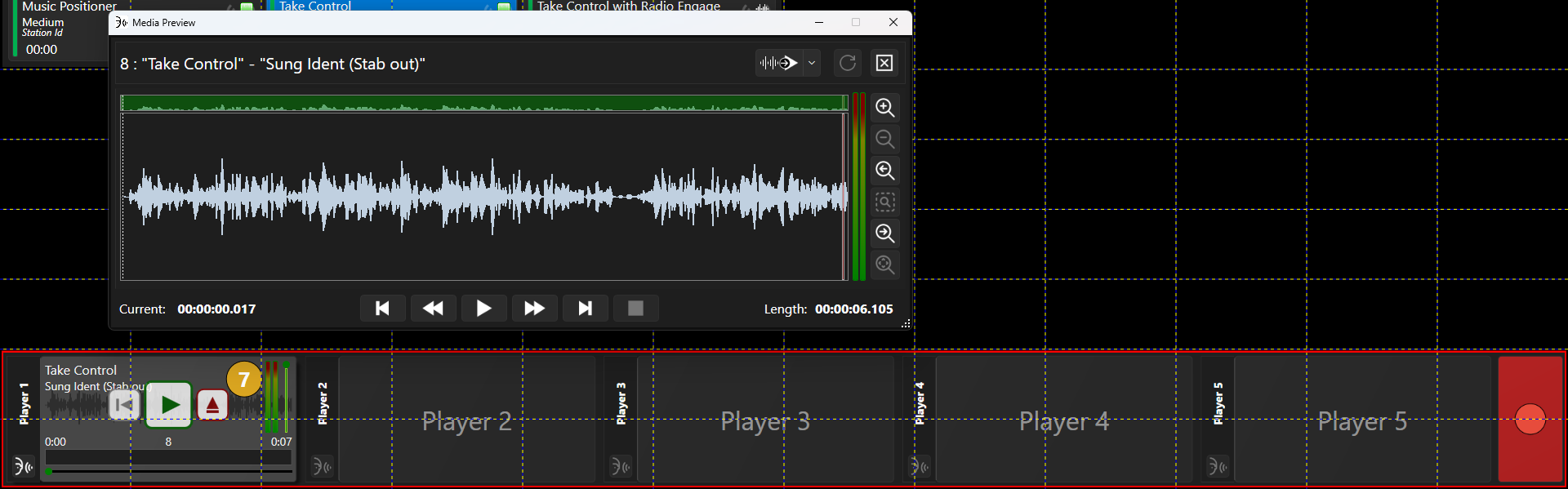
Media Preview Tile
The Media Preview Tile provide a convenient way of previewing content outside of the regular Media Players. You can drag Media Items from the Media Wall, Library, Favourites, Log etc to easily preview them using your designated preview sound device.
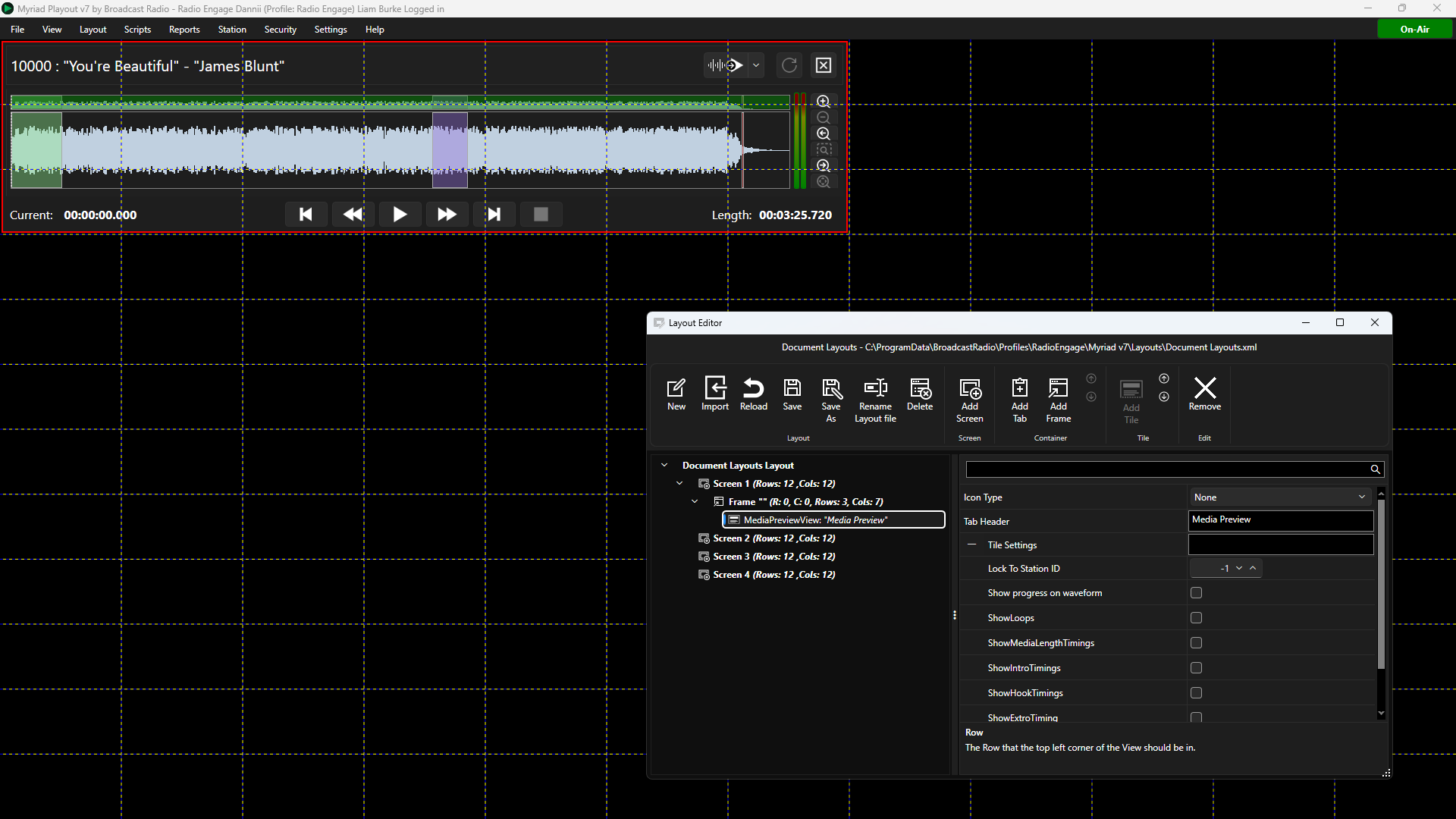
- Icon Type - Sets whether to display a icon on the Tile or not.
- Tab Header - Sets the Text to display on Tabs if placed in a Tabbed Container.
- Lock to Station ID - Locks the Tile to a specific Station ID number. If set to -1, the Clock will use the open Station (recommended).
- Show Progress On Waveform - Toggle whether to use a coloured fill on the wave form when playing.
- Show Loops - Shows the Loops panel to the left of the Preview waveform. You can add, edit or play loops from this panel.
- Show Media Length Timings - This option toggles whether to display the audio Start / End panel allowing you to review and edit the audio start and end times (ie trim silence from the beginning / end).
- Show Intro Timings - Toggles whether to show the Intro Start / End buttons to allow you to review and edit the Intro start and end.
- Show Hook Timings - Toggles whether to show the Hook Start / End buttons to allow you to review and edit the Hook start and end.
- Show Extro Timing - Toggles whether to show the Extro button to allow you to review and edit the Extro. Also enables the Auto Extro button.
- Show Trigger Items - Enables the trigger panels below each of the Timing buttons to allow you to attached a Media ID to trigger when the associated timing event is reached. Must be used in conjunction with the three timing settings above.
Mini Media Players Tile
The Mini Players Tile provides a cut down alternative to the standard Media Player Tile, with simplified Media Players suitable for smaller spaces within your layout.
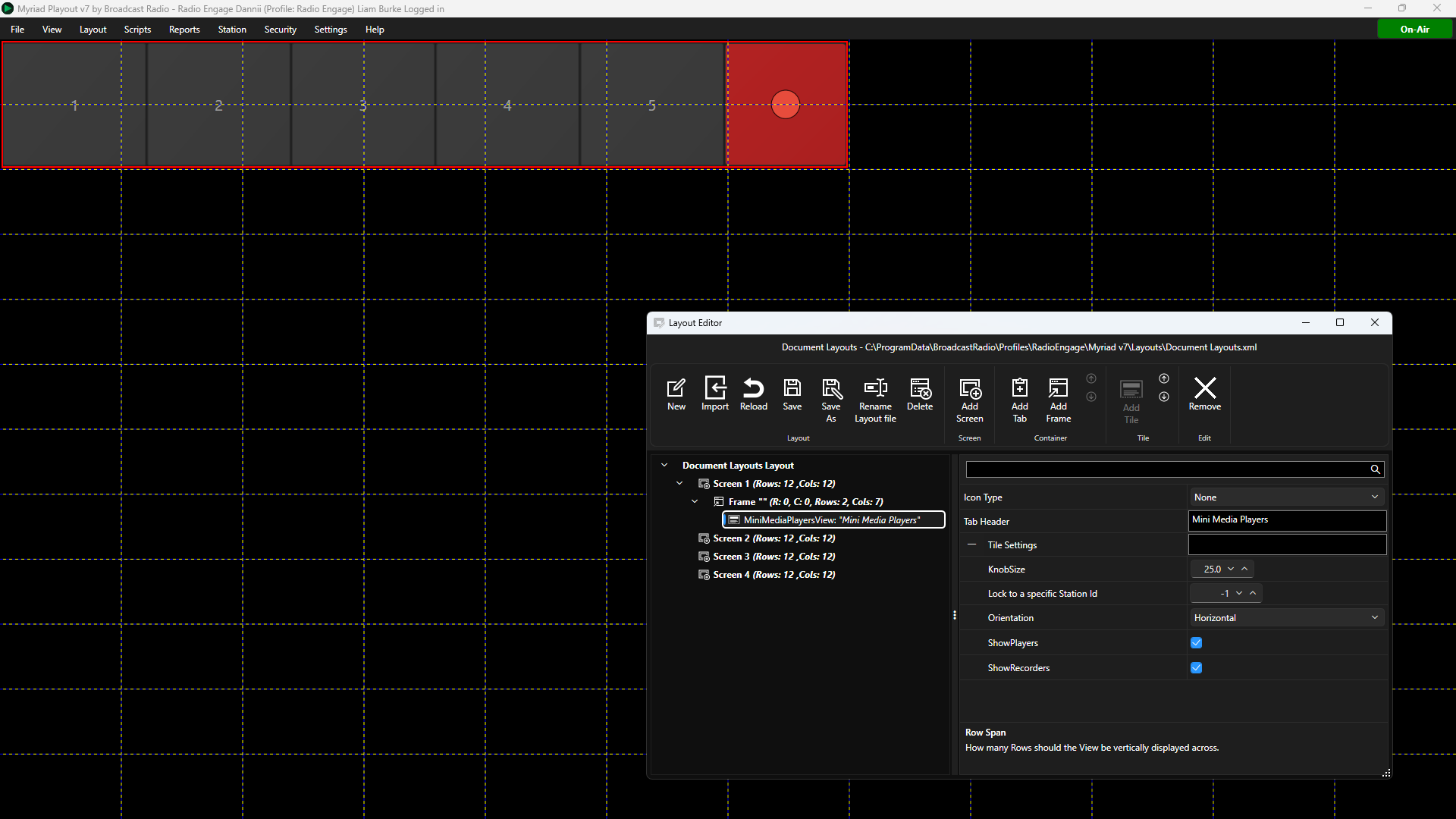
- Icon Type - Sets whether to display a icon on the Tile or not.
- Tab Header - Sets the Text to display on Tabs if placed in a Tabbed Container.
- Knob Size - Set the knob size (in pixels) for the volume control fader (when enabled).
- Lock to Station ID - Locks the Tile to a specific Station ID number. If set to -1, the Clock will use the open Station (recommended).
- Orientation - Set whether to stack the Media Players horizontally or vertically.
- Show Players - Toggle whether to show Media Players in this Tile.
- Show Recorder - Toggle whether to show the Recorder in this Tile.
Now Playing Tile
The Now Playing Tile allows Users to manually enter metadata information for the current and next playing item This is ideal for manual shows where Media Items are played directly (not from the Log). You should use in combination with Station Menu > Station Settings > Connections Tab > Allow users to manually set the Now Playing information option.
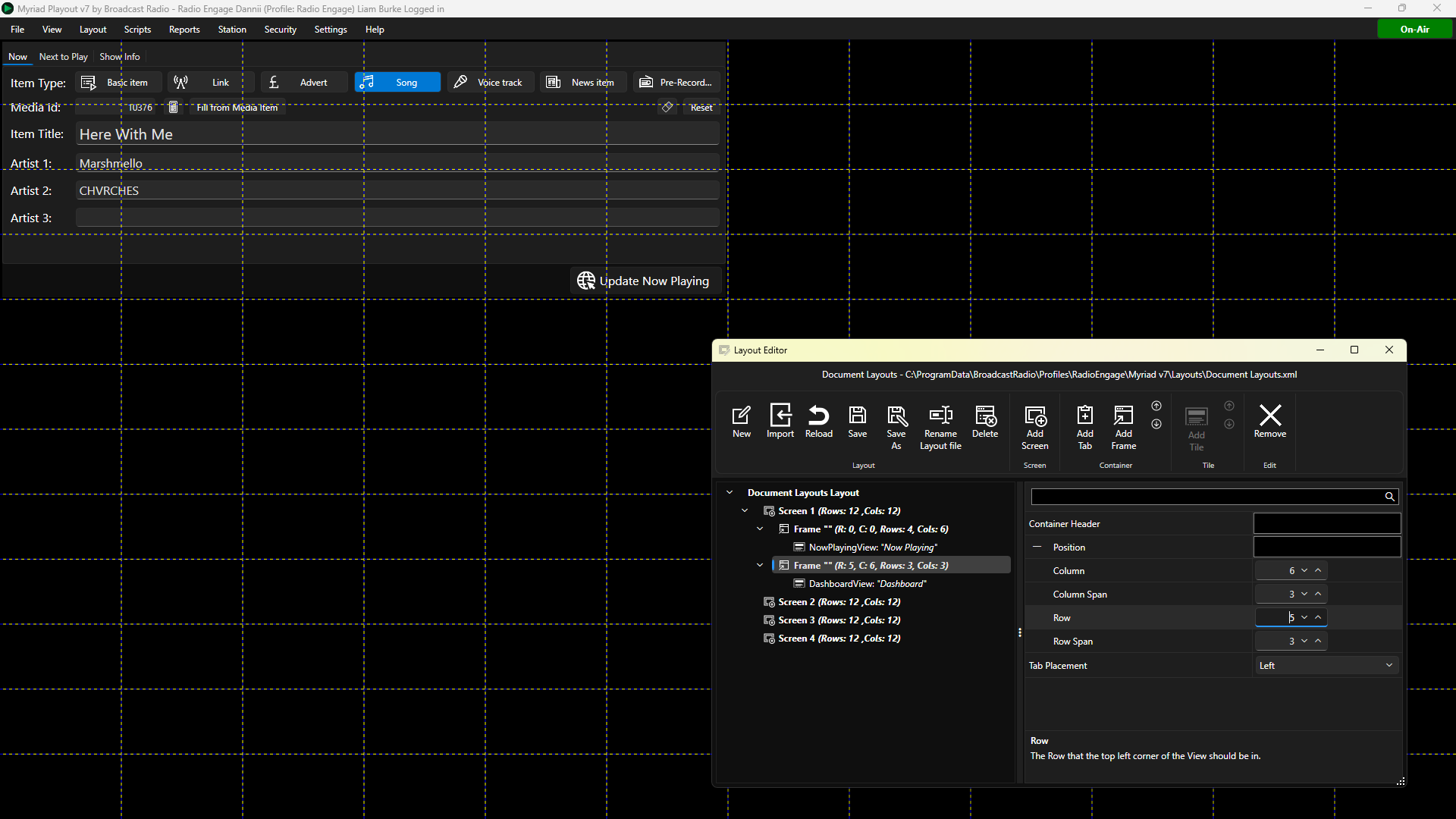
- Icon Type - Sets whether to display a icon on the Tile or not.
- Tab Header - Sets the Text to display on Tabs if placed in a Tabbed Container.
- Lock to Station ID - Locks the Tile to a specific Station ID number. If set to -1, the Clock will use the open Station (recommended).
Pad Tile
The Pad Tile is used to position a Pad on your Layout. This can be used to manually build sequences and shows which can be mixed down to a single Media Item, saved as a list or send to the Log.
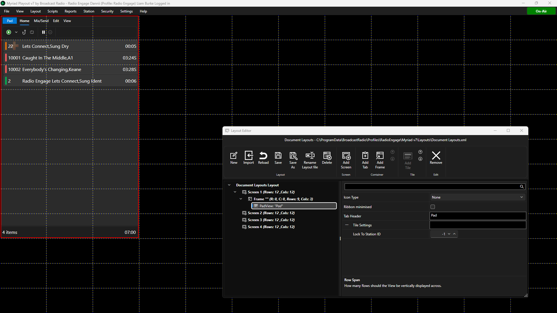
- Icon Type - Sets whether to display a icon on the Tile or not.
- Tab Header - Sets the Text to display on Tabs if placed in a Tabbed Container.
- Lock to Station ID - Locks the Tile to a specific Station ID number. If set to -1, the Clock will use the open Station (recommended).
Quick Play Tiles
Quick Play Tiles are similar to Favourites in that Media IDs can be assigned to them and triggered by simply clicking on them. Unlike Favourites, Quick Tiles can be permanently added to a layout and the Media ID triggered can be locked so Users cannot alter the assignments.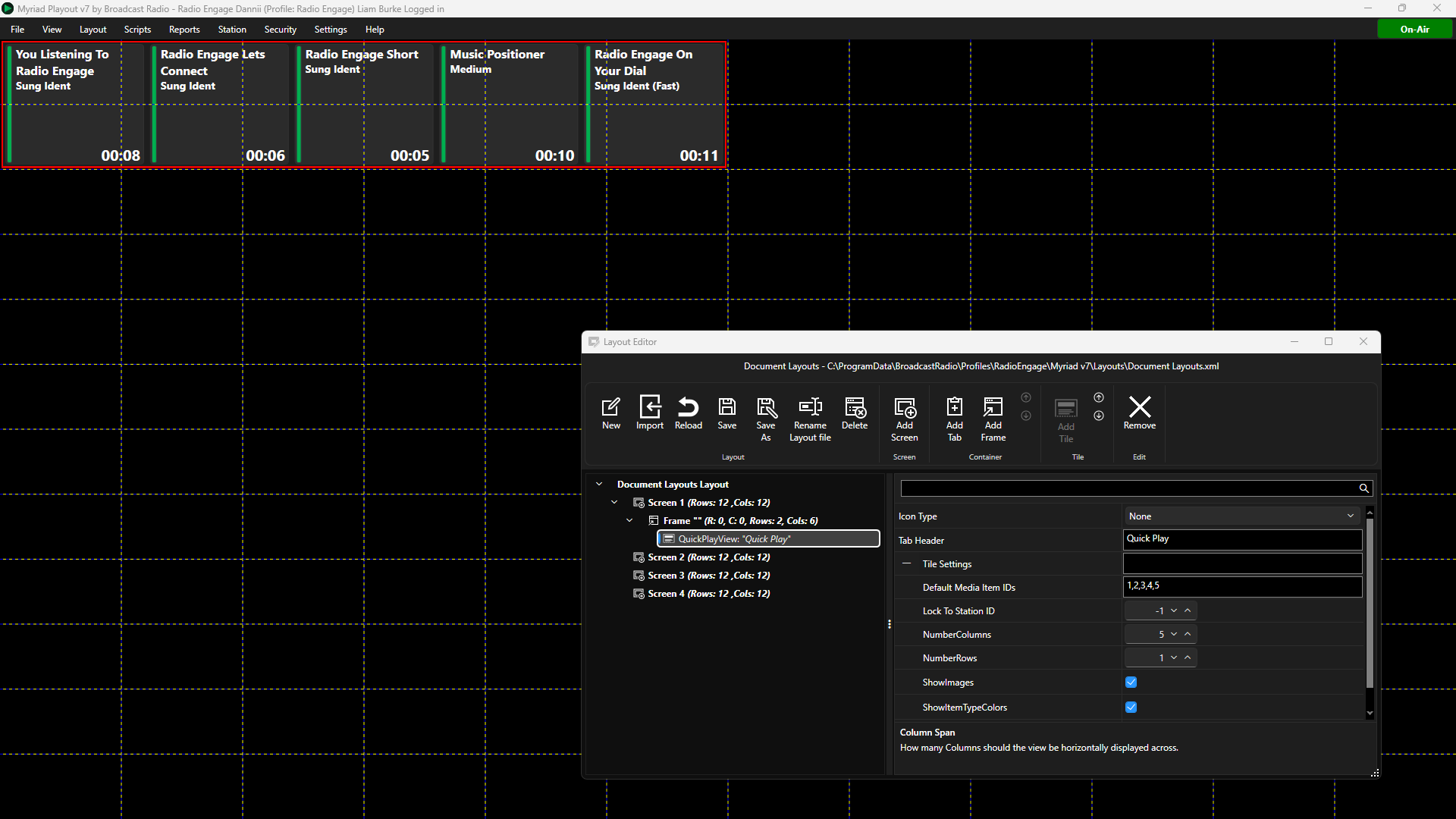
- Icon Type - Sets whether to display a icon on the Tile or not.
- Tab Header - Sets the Text to display on Tabs if placed in a Tabbed Container.
- Default Media IDs - This field sets the Media ID that is assigned to each Quick Play button. In the example above we have five Quick Play buttons and the Default Media ID is set to 1,2,3,4,5 - this means that clicking the first button will play Media ID 1 and clicking the forth button will play Media ID 4. If we wanted clicking the forth button to play Media ID 20, we would change the Default Media ID setting to 1,2,3,20,5.
- Lock to Station ID - Locks the Tile to a specific Station ID number. If set to -1, the Clock will use the open Station (recommended).
- Number of Columns - The Quick Play buttons are arranged in a grid of columns and rows, this setting is used to set the number of columns (five in this example).
- Number of Rows - The Quick Play buttons are arranged in a grid of columns and rows, this setting is used to set the number of rows (one in this example).
- Show Images - Toggle whether to display the assigned Media ID image.
- Show Item Type Colour - Toggle whether to display assigned Media ID Type Colour.
- Users Can Alter Assignments - Toggle whether Users can alter the assignments by dragging different Media Items onto the Quick Play buttons.
Quick Recorder Tile
The Quick Recorder Tile places a Quick Recorder into your Layout. The Quick Recorder can be used to quickly record, edit and process audio for Media Items.
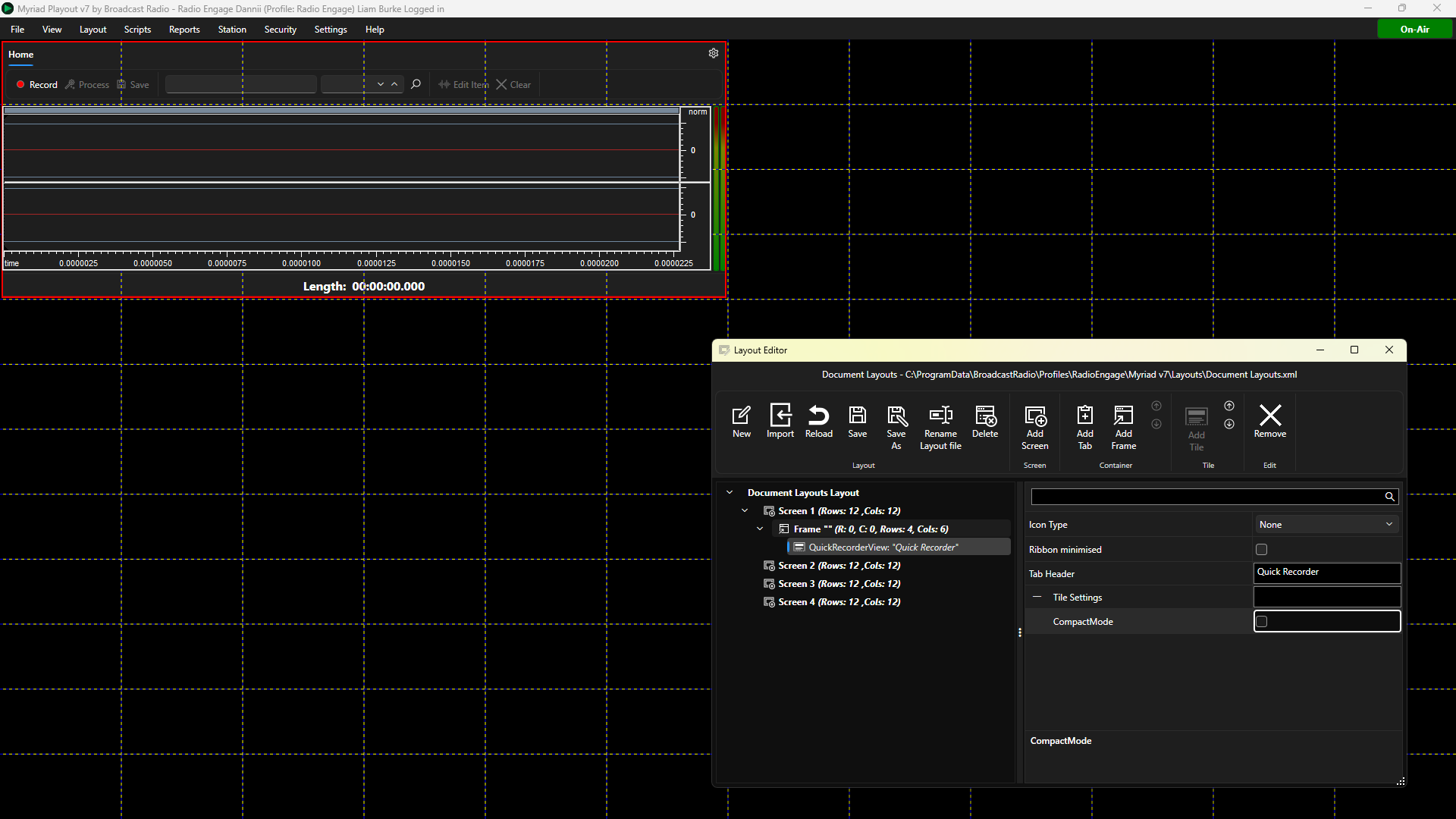
- Icon Type - Sets whether to display a icon on the Tile or not.
- Tab Header - Sets the Text to display on Tabs if placed in a Tabbed Container.
- Compact Mode - Toggles whether to display the waveform on the Quick Recorder Tile.
Segue Editor Tile
You can add a dedicated Segue Editor to your layouts with the Segue Editor.
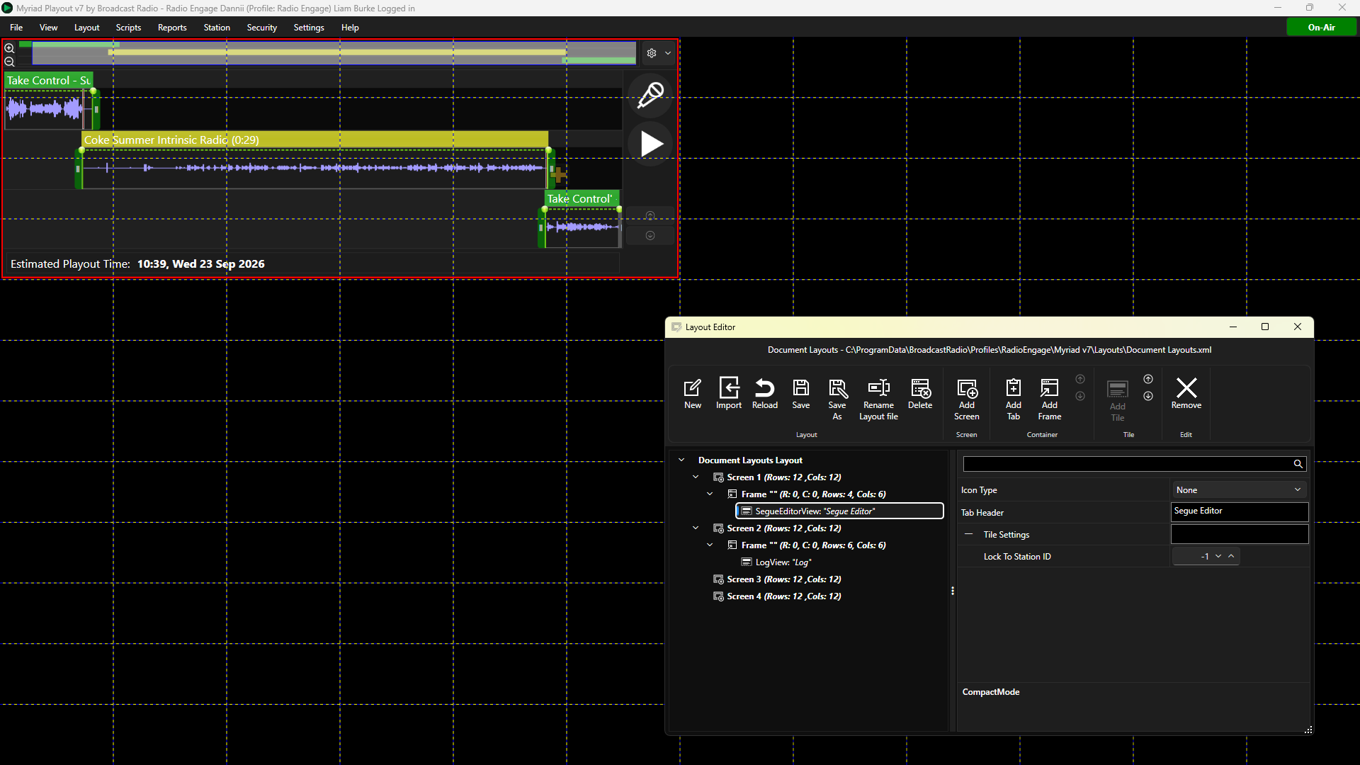
- Icon Type - Sets whether to display a icon on the Tile or not.
- Tab Header - Sets the Text to display on Tabs if placed in a Tabbed Container.
- Lock to Station ID - Locks the Tile to a specific Station ID number. If set to -1, the Clock will use the open Station (recommended).
Simple Mixer Tile
The Simple Mixer View Tile is used to display realtime information from a range of compatible mixing consoles. The list of compatible consoles includes:
- Broadcast Radio SRM v1 & v2
- D&R Webstation / Airlite / Airence / Auron
- AEQ Capitol / Forum IP
- Axia Livewire Driver
- Calrec Consoles
- DHD Consoles
- Wheatstone Consoles
This is primarily used to display ‘mic live’ information which gives a visual indication when one or microphone ‘faders’ are in the ‘open’ position.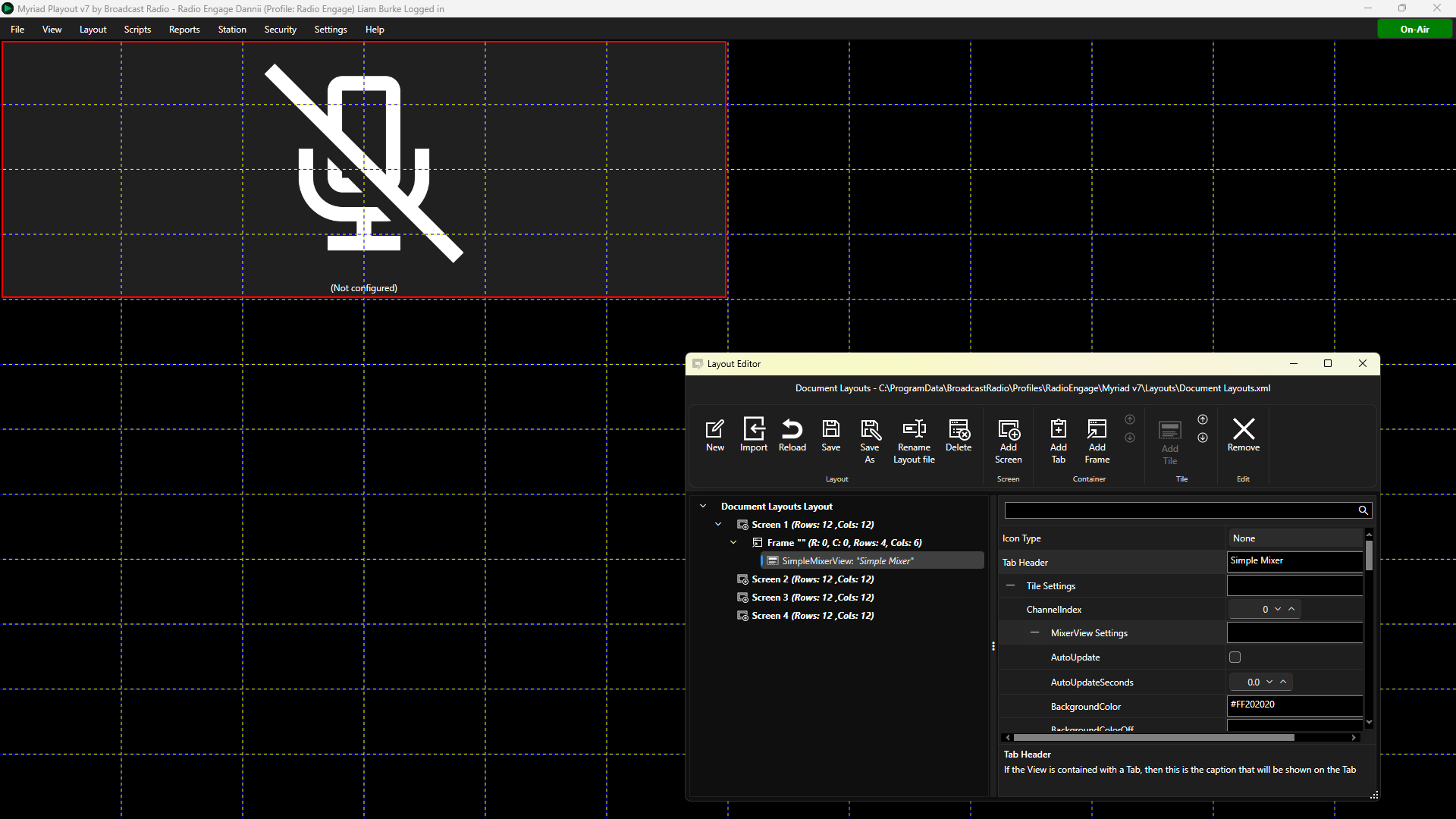
- Icon Type - Sets whether to display a icon on the Tile or not.
- Tab Header - Sets the Text to display on Tabs if placed in a Tabbed Container.
- Channel Index – This sets the hardware index channel that the Tile will respond to. If set to 0 then the Tile will activate when any microphone channel is in use. If you set the Index to a number (1-X) then the tile will only activate when the corresponding mic channel number is ‘open’. So as an example, if you wanted this Tile to only activate when the third microphone is active, set the Index to 3.
Expand the MixerView Settings node to access the following settings. - Background Colour Off - This set the colour for the Tile while the fader status 'not active'.
- Background Colour On - This set the colour for the Tile while the fader status 'active'.
- Fill With (Text / Image) – This allows you to set whether the text block or the image block is the primary element within the tile. This affects the positioning of the opposite element. So if we set the Fill With property to be ‘Image’ the then image is the primary element and the text will be positioned relative to the image using the Text Edge property (and the Image Edge property will be ignored).
- Image Position - Expand this node to get additional options:
- Edge - Set the position of the image in the Tile (Left, Top, Right, Bottom).
- Horizontal Alignment - Set how the image is aligned horizontally (left, center, right, stretch).
- Margin - Set margin in pixels around the image (left, top, right, bottom),
- Padding - Set padding inside image container (left, top, right, bottom).
- Vertical Alignment - Set how the image is aligned vertically (top, center, bottom, stretch).
- Image Background Colour - Set the colour to display behind the image using the colour picker or an eight digit hex code.
- Image Border Colour - Set the colour of the boarder applied around the image.
- Image Border Thickness - Set the thickness in pixels, of the boarder surround an image (left, top, right, bottom).
- Margin - Sets the margin in pixels, around the Tile (left , top, right, bottom).
- Text Position - Expand this node to get additional options:
- Edge - Set the position of the text in the Tile (Left, Top, Right, Bottom).
- Horizontal Alignment - Set how the text is aligned horizontally (left, center, right, stretch).
- Margin - Set margin in pixels around the text (left, top, right, bottom),
- Padding - Set padding inside the text container (left, top, right, bottom).
- Vertical Alignment - Set how the text is aligned vertically (top, center, bottom, stretch)
- Text Colour Off - Set the colour of the text when the assigned mixer channel is in the 'off' state.
- Text Colour On - Set the colour of the text when the assigned mixer channel is in the 'on' state.
- Text Value Off - Set the text to display when the Text Value Path is in the 'off' state (ie Mic Off).
- Text Value On - Set the text to display when the Text Value Path is in the 'on' state (ie Mic On).
All other settings can be ignored as they are reserved for future use but will not affect your Smart Mixer Tile.
Smart Display Tile
The Smart Display Tile is a general tool for displaying text and images within a layout. It can also change the value of the text images and colours based on external inputs or triggers such as hardware inputs or User clicking on the Tile.
Use cases include:
- Display station name or logo.
- Adding labels to layouts.
- Mic live indication (driven by the BR Hardware Service).
- Studio switching (both indication and driving switching hardware outputs).
- Phone ring and other alarm signals.
The Smart Display Tile shares many attributes with the Simple Mixer Display Tile, but is used as a more general purpose solution.
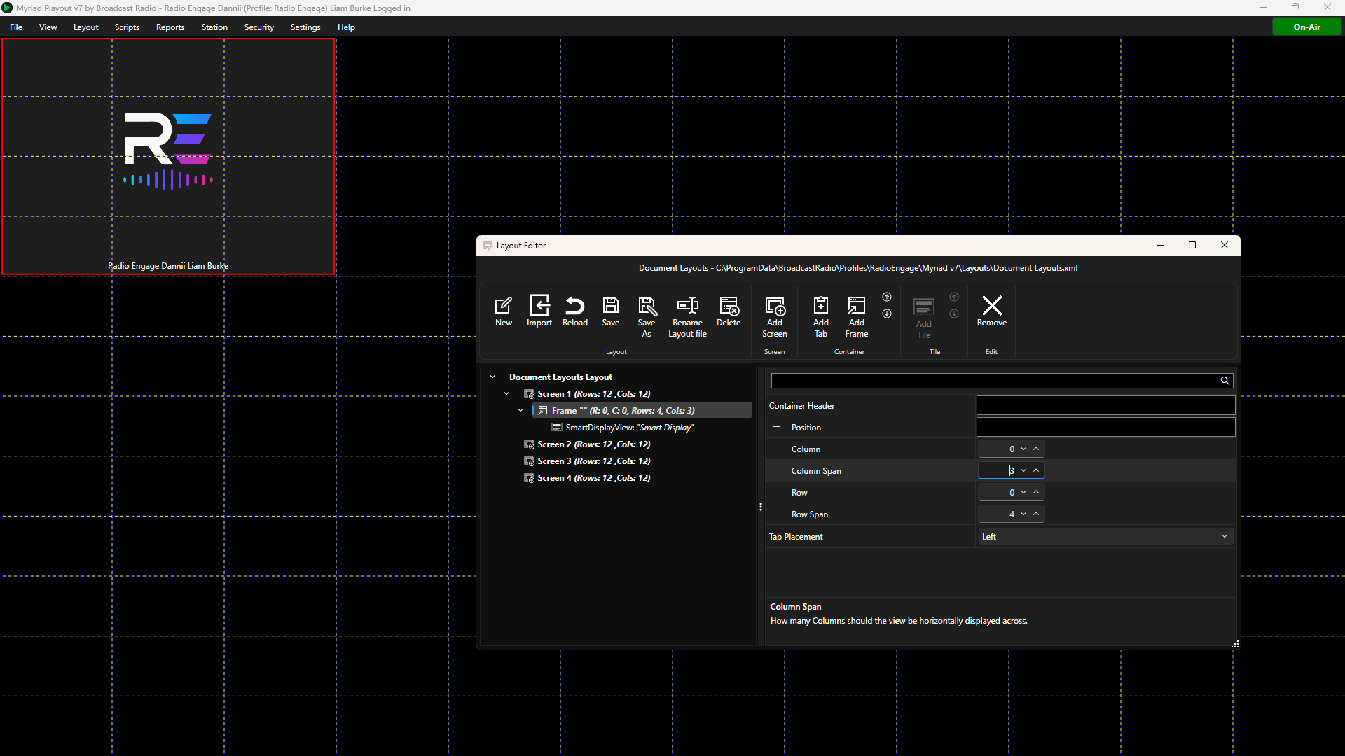
- Icon Type - Sets whether to display a icon on the Tile or not.
- Tab Header - Sets the Text to display on Tabs if placed in a Tabbed Container.
Expand the Smart Display Settings node to access the following settings. - Auto Update - Toggles whether Myriad should check status (as opposed to only reacting to status changes).
- Auto Update Seconds - This sets the interval to Auto Update.
- Background Colour -Sets the background colour for the Tile. Use the colour picker or type in a color hex code. Please note the hex color code consists of two characters for alpha transparency (FF opaque to 00 for transparency) plus six characters for colour.
- Background Colour Off - This set the colour for the Tile while the status 'off'.
- Background Colour On - This set the colour for the Tile while the status 'on'.
- Fill With (Text / Image) – This allows you to set whether the text block or the image block is the primary element within the tile. This affects the positioning of the opposite element. So if we set the Fill With property to be ‘Image’ the then image is the primary element and the text will be positioned relative to the image using the Text Edge property (and the Image Edge property will be ignored).
- Hardware Line Address - Use the drop down options to select the Device ID and Line ID to trigger the 'active' state via hardware inputs via the Broadcast Radio Hardware Service.
- Image Location - You can browse and set a base image. This will be displayed when status is not available.
- Image Position - Expand this node to get additional options:
- Edge - Set the position of the image in the Tile (Left, Top, Right, Bottom).
- Horizontal Alignment - Set how the image is aligned horizontally (left, center, right, stretch).
- Margin - Set margin in pixels around the image (left, top, right, bottom),
- Padding - Set padding inside image container (left, top, right, bottom).
- Vertical Alignment - Set how the image is aligned vertically (top, center, bottom, stretch)
- Image Background Colour - Set the colour to display behind the image using the colour picker or an eight digit hex code.
- Image Border Colour - Set the colour of the boarder applied around the image.
- Image Boarder Thickness - Set the thickness in pixels, of the boarder surround an image (left, top, right, bottom).
- Image Location On – Allows you to set the location of an image to display when the Smart Mixer View is active.
- Image Location Off – Allows you to set the location of an image to display when the Smart Mixer View is not active.
- Lock to Station ID - Locks the Tile to a specific Station ID number. If set to -1, the Clock will use the open Station (recommended).
- Margin - Sets the margin in pixels, around the Tile (left , top, right, bottom).
- Show Current User Profile Image - Shows the Presenter Image of the currently logged in User.
- Show Log Current Item Time Played - Displayed the played time of the currently playing Log Item.
- Show Log Current Item Time Remaining - Displayed the time remaining in the currently playing Log Item.
- Show Log Current Title - Displayed the Title for the currently playing Log Item.
- Show Station Logo - Display the logo image associated with the open Station.
- Text Position - Expand this node to get additional options:
- Edge - Set the position of the text in the Tile (Left, Top, Right, Bottom).
- Horizontal Alignment - Set how the text is aligned horizontally (left, center, right, stretch).
- Margin - Set margin in pixels around the text (left, top, right, bottom),
- Padding - Set padding inside the text container (left, top, right, bottom).
- Vertical Alignment - Set how the text is aligned vertically (top, center, bottom, stretch)
- Text Value - The default text to display.
- Text Alignment - Set the alignment for the text (left, center, right, justified).
- Text Colour - Set the default colour for the text using the colour picker.
- Text Colour Off - Set the colour of the text when the assigned mixer channel is in the 'off' state.
- Text Colour On - Set the colour of the text when the assigned mixer channel is in the 'on' state.
- Text Font Family - Set the Font for the displayed text.
- Text Font Size - Set the Font size for the displayed text.
- Text Font Weight - Set the Font weight for the displayed text (Normal, bold, italic etc)
- Font Rotation Angle - Set the angle to display the text.
- Text Source URL - Allows the text to be read from a simple plain text HTML page. Set the location URL for default text.
- Text Source URL Off - Allows the text to be read from a simple plain text HTML page. Set the location URL for when simple mixer channel is in 'off' state.
- Text Source URL On - Allows the text to be read from a simple plain text HTML page. Set the location URL for when simple mixer channel is in 'on' state.
- Text Source URL Password - Allows you to set a password to access protected URL source pages.
- Text Source URL Use Basic Auth - Enables simple username and password authentication for the source URL.
- Test Source URL Username - Allows you to set the username to access protected URL source pages.
- Text Source Value Numeric Display Format - Allows you to add limited formatting to numeric values in text source URL. Formatting is based on typical .NET numeric string formatting.
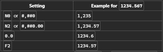
- Text Source Value Path - This is used to describe where in a json file, the numeric value is located. If the json has 5 levels of nested json properties, that path tells it to go into the json, find top node a, then down it's its B, then that one's c and so on then get the value at the end
- Text Value Off - Set the text to display when the Text Value Path is in the 'off' state (ie Mic Off).
- Text Value On - Set the text to display when the Text Value Path is in the 'on' state (ie Mic On).
- Text Tile Tool Tip - Set the text to display when a User hovers over the Smart Mixer Tile.
Smart Info Tile
You can add a Smart Info Tile to your layout to allow Users to contextual information about the selected Media Item or more general information such as local traffic and weather.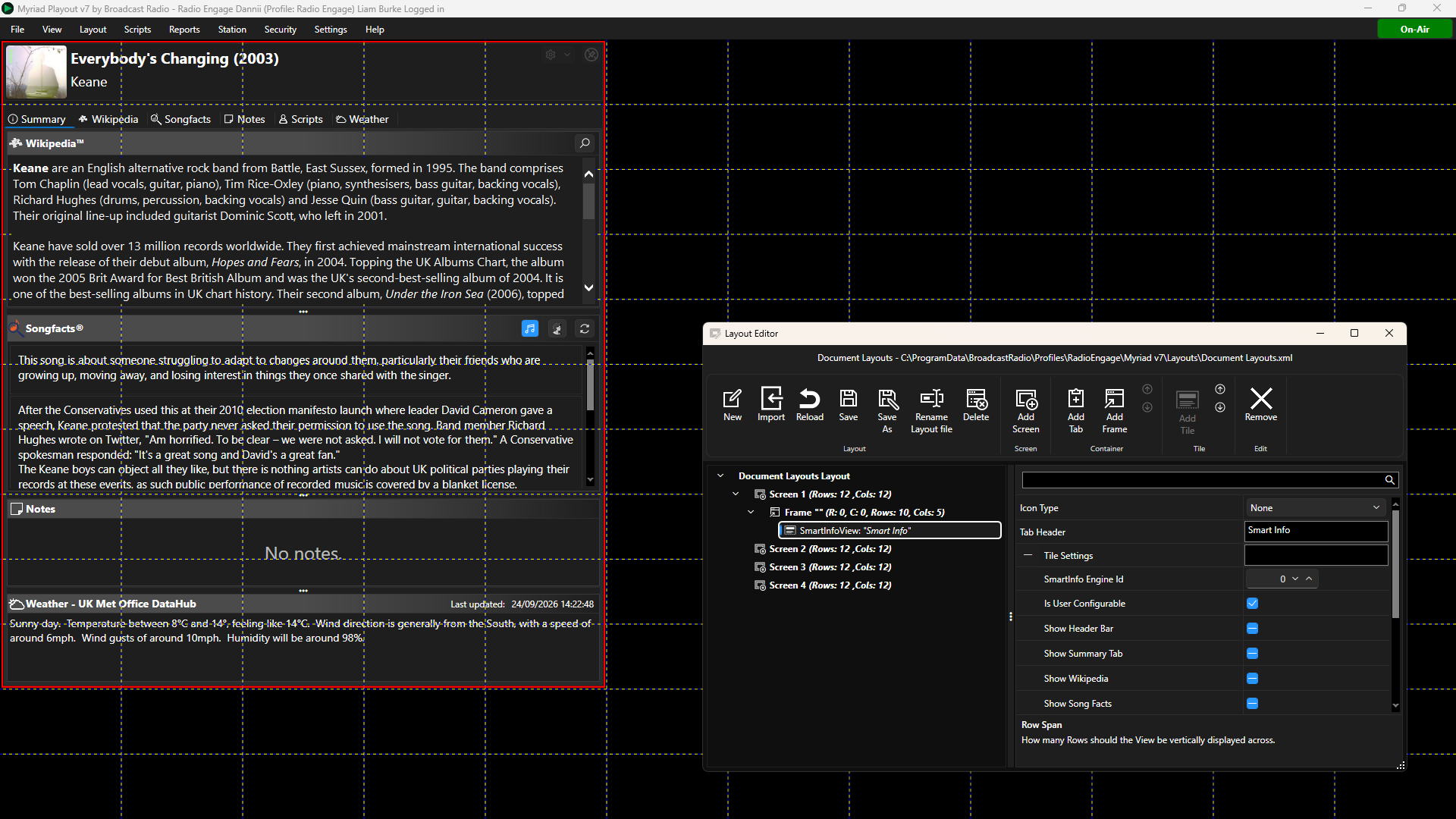
- Icon Type - Sets whether to display a icon on the Tile or not.
- Tab Header - Sets the Text to display on Tabs if placed in a Tabbed Container.
- SmartInfo Engine ID - This allows you to assign a unique ID number to this Smart Info Tile. Sources such as Dashboard, Log, Library and Media Wall can also have a SmartInfo Engine ID set, which determines which Smart Info Tile they send information to when a User selects a Media Item.
- Is User Configurable - This option toggles whether the User can choose which tabs are visible and which are included in the Summary page.
- Show Header Bar - Toggles whether to display the header bar along the top of the Tile.
- Show Summery Tab - Toggles whether to display the summary tab.
- Show Wikipedia Tab - Toggles whether to display the Wikipedia tab.
- Show Song Facts Tab - Toggles whether to display the Song Facts tab.
- Show Notes Tab - Toggles whether to display the Notes tab.
- Show Weather Tab - Toggles whether to display the Weather tab.
- Show Traffic Tab - Toggles whether to display the Traffic tab.
- Show Scripts Tab - Toggles whether to display the Scripts tab.
- Show Customer X Tab - Toggles whether to display the Custom X tab.
Split Manager Tile
The Split Manager Tile is used to display Split Advert and Split Group information for radio stations with split playout enabled.
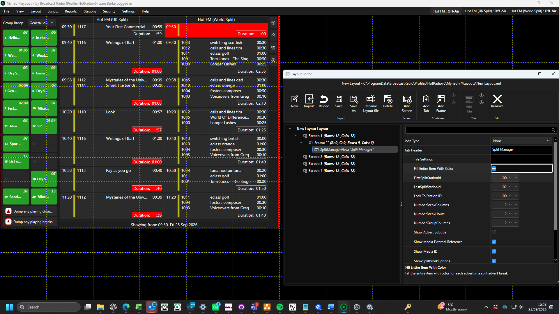
- Icon Type - Sets whether to display a icon on the Tile or not.
- Tab Header - Sets the Text to display on Tabs if placed in a Tabbed Container.
- Fill Entire Item With Colour - This option toggles whether Split Adverts should be filled with the configured Advert Log colour or just have a colour indicator to the side (similar to options on the Log and Media Wall).
- First Split Station ID - Allows you to set the Split Station ID for the first Station to be listed in the Split Station Manager Tile. The Tile will show all Split from Station ID X to Station ID Y. In this example, our split stations are on ID's 100 & 101, so we should set the First Split Station ID to 100.
- Last Split Station ID - Allows you to specify the final Station ID to be displayed in the Tile. In this example, our split stations are on ID's 100 & 101, so we should set the First Split Station ID to 101.
- Lock to Station ID - Must be set to a Station ID for any of the split Stations. In this example, our Split Stations are on ID's 100,101 and 102 so the Lock Station ID needs to be set to 100 or 101.
- Number of Break Columns - Sets the number of columns to display. This should be set to the same number as the amount of splits you have running.
- Number of Break Hours - Limits the number of hours forward to display in the Split Manager.
- Number of Group Columns - Sets the number of columns in the Split Groups panel to the left of the Tile.
- Show Advert Subtitle - Toggles showing line two of the Advert Media Item.
- Show Media ID - Toggles showing the Media ID.
- Show Split Break Options - Toggles whether to display the button to access Split Break options.
- Show Split Breaks - Toggles whether to display Split Advert Breaks (turn off if you are only using Split Groups).
- Show Split Groups - Toggles whether to show Split Groups (turn off if you don't use Split Groups).
Split Station Tile
The Split Station Tile provides a passive view of the split advert breaks for a selected Station. It can be used for monitoring purposes within a layout.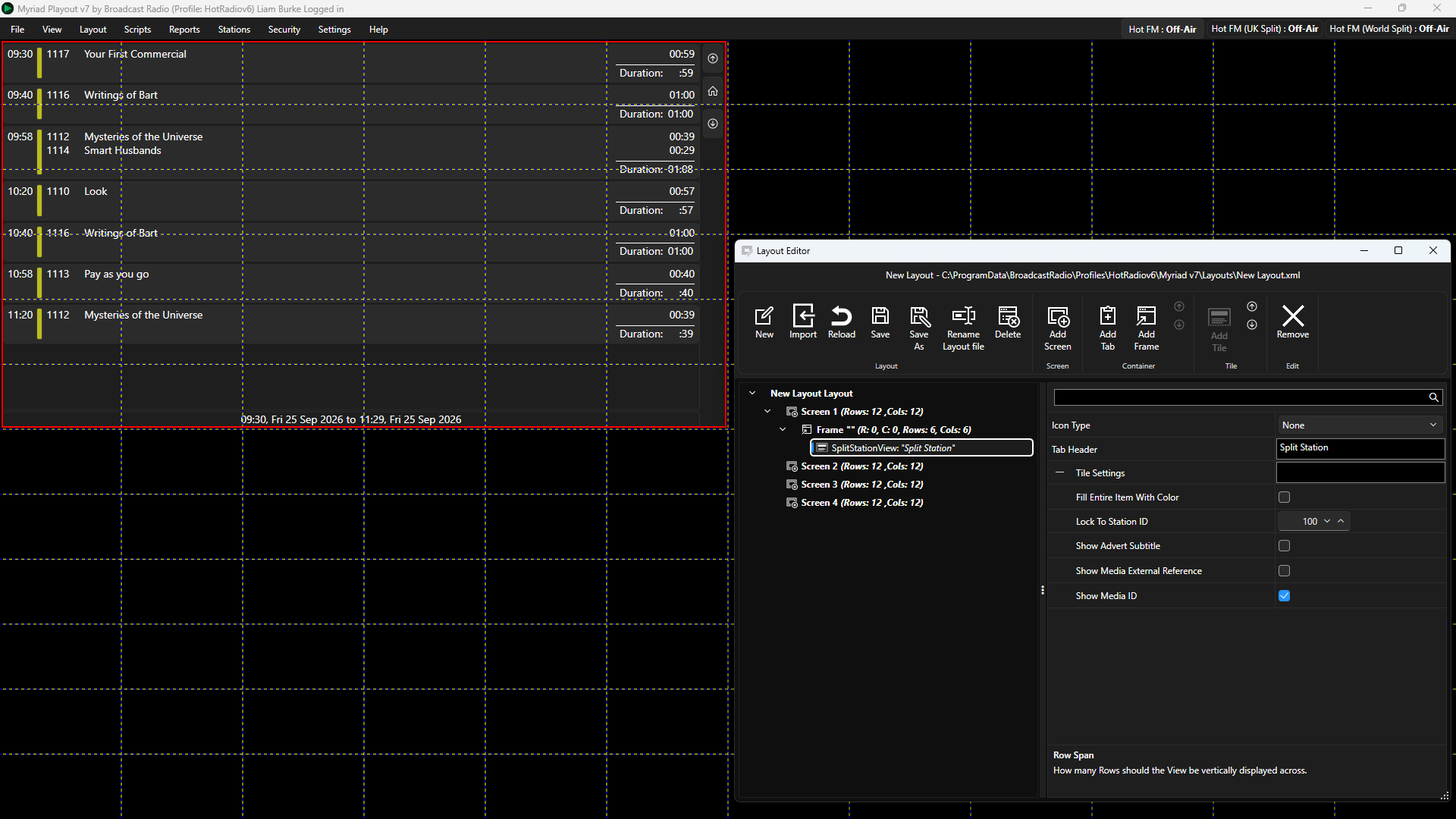
- Icon Type - Sets whether to display a icon on the Tile or not.
- Tab Header - Sets the Text to display on Tabs if placed in a Tabbed Container.
- Fill Entire Item With Colour - This option toggles whether Split Adverts should be filled with the configured Advert Log colour or just have a colour indicator to the side (similar to options on the Log and Media Wall).
- Lock to Station ID - Must be set to a Station ID for any of the split Stations. In this example, our Split Stations are on ID's 100,101 and 102 so the Lock Station ID needs to be set to 100 or 101.
- Show Advert Subtitle - Toggles showing line two of the Advert Media Item.
- Show Media External Reference - Toggles showing the Media ID External Reference.
- Show Media ID - Toggles showing the Media ID.
Related Articles
Was this article helpful?
That’s Great!
Thank you for your feedback
Sorry! We couldn't be helpful
Thank you for your feedback
Feedback sent
We appreciate your effort and will try to fix the article